Telegraph redesign review - Part 1
I had a couple of people get in touch and ask if I was going to be doing a review of The Telegraph's recent re-design. In truth, with my trip to Macau, and a scarcity of Internet access over the last few weeks, the Telegraph site had been live for a while before I even got to have a peek at it out of curiosity, let alone to do an in-depth review.
It didn't, at the time of writing, look like the finished deal yet, as a few of the section indexes were still in the old design. Nevertheless, a few points occurred to me, which I'll be going through over the next couple of days...
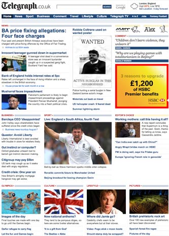
Smaller masthead - no boasting, no web search
For some time The Telegraph has used the masthead area on the website to point out their success in user stats from HitWise or some such other award winning badge. In January this year it was being 'Best consumer online publisher'.

The new masthead features a smaller logo, and no boasting. That leaves room for a nicer looking and more prominent search box. There is a more muted logo from technology partner Google, and the search box is brought front-and-centre of the page.
A radio button option to choose between searching The Telegraph site or the web in the old design has been dropped.
The option to search the web directly from The Telegraph seems to have disappeared completely, although there are plenty of options for refining a search to a particular section of the newspaper.
Shallow top navigation
The Telegraph has opted to drop the left-hand navigation from their homepage, and to concentrate instead on a shallow set of top navigational categories. These cover the areas you would expect the paper to be strong on - News, Sport, Business and Comment. There are also links to Travel, Lifestyle and Culture sections, as well as to the newspapers online video output - Telegraph TV. Motoring has been ousted from the previous top-level navigation line-up.
This is a very similar navigational solution to the one employed by The Guardian, Daily Mail and The Independent. In contrast to the The Independent, there is no 'second tier' of navigation available to users from the front page. Holding the mouse over an item highlights it, but doesn't reveal any extra options. So, for example, to get to 'Cricket', the user must select 'Sport', and wait for the page to load before being able to select 'Cricket'.
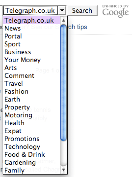
More Telegraph.co.uk navigational "bucket"
I took an instant dislike to the Telegraph.co.uk navigational "bucket" at the foot of the page. I call it a bucket, because from the outside it simply looks like a bunch of links chucked together because they used to sit in the left-hand navigation, and now they have nowhere to go. The list is in alphabetical order, but far from comprehensive.

The rules governing which links appear don't seem to be internally consistent. Most of the primary navigation headings from the top of the page are repeated in the footer, except for 'Lifestyle' and 'Telegraph TV'.
'Football' earns a spot, but none of The Telegraph's other great sport coverage merits a direct link to the section - not even the topical Olympics or the seasonal summer Cricket, both of which must be at their peak of usage during this time of year.
There are also unhelpful labels which may mean a lot inside Telegraph HQ, but mean little to the user. If there is a 'Feature' about Christian Dior, will I find it faster by clicking 'Features', or by clicking 'Fashion'?
Next...
Tomorrow I'll be looking further than the new design's navigation, with a post examining how The Telegraph has improved some visual cues to content, and perhaps not made the best of others. I'll also be looking at how the site handles links to social media sites.