The Daily Mail site redesign: Part 4 - Hovering preview
I've been reviewing the recently updated Daily Mail website design. So far I've been impressed with some clever RSS feeds and some enticing ways of promoting the message boards. However, I've also been concerned about the very long loading times over dial-up caused by the sheer weight of the pages.
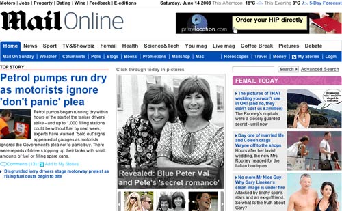
I first reviewed the new design a couple of months back when it was a 'beta', stressing the new features that I liked. There were a couple of things that concerned me, and one of them was the way that the contents of the main newspaper sections were 'previewed' when you hovered your mouse over the main navigation.

When the new design launched fully to the public, this feature was still in place. The Daily Mail have subsequently removed it. I can only speculate whether that was as a result of user feedback, or as a result of technical performance issues - but either way I am glad it is gone.
That hovering navigation preview
I always felt that the 'hovering preview' navigation was one of those features that looked great on the test-bench, and everyone was pleased to have successfully developed, but was the type of feature that caused more usability problems than it solved.
I've already mentioned that the pages have a very heavy download footprint. The 'preview overlay' didn't render properly until all of the CSS images it required had downloaded. That may be a matter of seconds on broadband, but on anything less than a high-speed connection it took seconds before this feature produced anything other than a rendering mess.
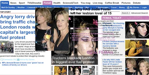
The feature put accessibility barriers in the way of the user as well. Accessibility isn't just about providing 'Alt text'. One of the major issues facing older surfers is imprecise control of the mouse. Anything that relies on hitting a small exact number of pixels on the screen can be difficult for anyone with less than 100% motor control or less than 20/20 vision. It was very easy on the new Daily Mail design, when trying to select one of the sub-menu items, to accidently stray into the area that triggered the 'preview overlay', hiding the link that you were trying to follow.
The positioning of the 'preview overlay' also dictated to the user how they could use the top navigational toolbar. Generally when scrolling back up to elements at the the top of the page, users find it easier to scroll their mouse to the very top of the screen, and then gradually work their way back down. The layout here prevented that, as the 'preview overlay' was triggered as you scrolled back down.
The question really is 'what problem was this feature trying to solve'? The answer seems to have been that it promoted to the user the contents of the sub-sections of the site. However there are already 140 different content objects on the homepage for them to choose from, so losing the preview has not made navigation harder, and probably made using the page easier. Dropping the feature was the right decision in my view.
Tomorrow...
Tomorrow I'll be concluding my review of the Daily Mail redesign with a look at a section of the site that has changed much for the better, is bold and ambitious, and demonstrates a real understanding of the modern web.