The Daily Mail site redesign: Part 3 - Story layout and download footprint
This week I've been writing a review of the Daily Mail's new website design - concentrating on some of the aspects of navigation, the message boards, and their innovative use of celebrity-led RSS feed categories. Today I want to look at the individual story pages and the index pages that lead to them.
Story pages
The whole point of the re-design is, of course, to get more people to visit the site for longer, in order to get more eyeballs in front of adverts. For that reason the most crucial page design is the individual 'story' page. I expressed a concern when I looked at the 'beta' of the site that the new design didn't seem to have done much to increase the readability of story pages, or allow them to be more flexible with their content.
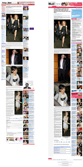
I think this issue has carried through to the final design. The Mail's story pages used to be constricted in width because of a lengthy left-hand navigation pane. This has been removed, which could have allowed the designers to increase the width of the body copy, and include larger image sizes and embedded video. Instead, they appear to have been forced to incorporate an extra skyscraper advert into the space where the left-hand navigation used to sit.

I'm left wondering whether over time they will be able to drop that advert and increase the width of the content, or whether that is a done commercially-driven decision that they have to live with.
For the record, stories on the Mail site are 470 pixels wide, which compares favourably with the re-designs of the Guardian, Telegraph and Times sites, which allow content to run to at 460, 400 and 384 pixels respectively. However, somehow, the additional advert on the left-hand side leaves the page feeling more cramped than the previous design.
Big, big pages
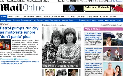
Another thing about the new Daily Mail design is that it is big. And I don't just mean the size of the fonts used for the headlines. The index pages have a very heavy download footprint, and are very, very, very long. On the day I tested it, the homepage was 6,369 pixels long - that is ten pages worth of scrolling on my MacBook.

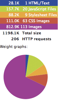
And long means heavy - Firebug puts the download footprint of the Mail's front page at a whopping 1198.1k.
Now, I know that broadband users are probably the most lucrative demographic to advertisers, but there are still 2.6 million Internet users in the UK on dial-up. My back-of-an-envelope calculations suggest that on a 56k modem the new Daily Mail homepage is going to take more like minutes than seconds to fully download.
The homepage is also jam-packed with content as well. On the screengrab above, I counted links to 140 items of content - and that was without using any of the sliders or tabs that reveal more links. It feels a little bit like management committee edicts that 'showbiz is important', 'promoting the blogs is important', 'we must appear to still be serious about world news', 'we want to promote the new message boards' and so on have left the designers with little choice but to include everything, to the detriment of the overall user experience.
I note that the homepage has also ditched the left-hand navigation, and so the number of navigational paths to topic or subject indexes has been reduced. I wonder if that has been a factor in trying to cram so many links onto the page.
The homepage wasn't the greatest offender in the download footprint stakes incidentally, the 'Live Mag' homepage came in at over 2Mb to download. Ouch!
Next...
In the next part of this series I'll be looking at one feature of the 'beta' re-design that only made it into the finished version of the site for a week or so before, thankfully, being ditched.
You thought the Daily Mail's pages are big - try http://www.20minutes.fr/