Has Boris Johnson switched 'off' the Mayor of London 'ON' branding?
Within a day of Boris Johnson announcing his initiative to ban alcohol on London's Transport network, posters started appearing about it on the Underground. I noticed something interesting on them.
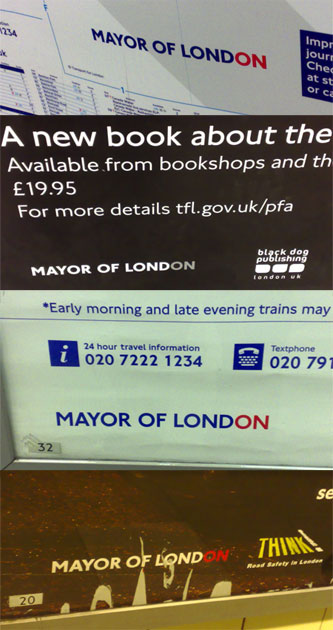
Since the inception of the office of the London Mayor, publicity material that has passed through the Mayor's office has had a distinctive branding - 'MAYOR OF LONDON', with the last two letters picked out in a different colour.
Generally this has been blue with the last two letters in red, although there have been variations, as this selection of posters snapped at Queensway station yesterday shows.
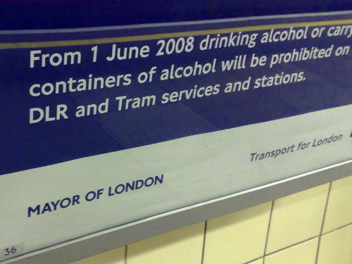
However, the new drinking ban poster appears to have ditched this branding element.
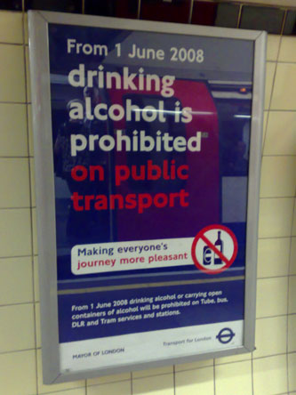
It can't be because the poster wasn't a full colour production, as you can see that red as well as blue has been used. So, could it be a conscious branding decision to ditch the red 'ON' (which has Labour Party connotations) and replace it with a pure true blue Conservative coloured logo?
Of course, it might just be an oversight by a new Mayor's comms team in the first couple of days in office, who approved something without checking the branding guidelines first. I guess only time will tell, but with the promised cut-back in promotion and marketing from the Mayor's office already taking shape, who knows when we'll see another poster to confirm this.
I got a leaflet from the Docklands Light Railway through my letterbox today. It has the ON at the end of MAYOR OF LONDON printed in blue. However, the blue is DLR blue (Pantone 326). Maybe the colour of the ON changes according to what it's representing.
That gives me shuddery memories of being told "Sorry, that design isn't 'Sony Audio Blue'"
I noticed the lack of the ON branding on the alcohol posters too. Definitely non-standard.
Noticed last night that there's a couple of new posters on the tube with the lack of multi-coloured ON branding.
All the recent posters all seem to share one thing in common - not much use of colour. Very flat, very few colours used. Whether it's some new house style, or related to Boris's plans to stop all that "wastage", is hard to say. Notably the websites continue with the multicoloured approach.
And it appears that Boris is busy tackling the important issues. The London logo on the TfL website is now pure blue.
Apparently something in The Times about it but I couldn't find it - however it's mentioned in the Guardian's Media Monkey.
I remember reading about this a few months back as well, and a friend who had just come back from London also recently mentioned it. They have apparently stopped the "On" brand, which is a pity, as I thought it was a pretty cool concept.
the 'On' branding was dropped in October 2008. I only worked this out when I did a search online and downloaded the new TFL corporate-publications-issue04. They clearly show a single colour logo in blue