7 things I like about the Daily Mail Beta
Regular readers may have noticed that I find it very easy to write article after article moaning "Well, I wouldn't have done it like that" about newspaper websites, so I thought I'd try a different tack for a change. Instead of the usual currybetdotnet "Here is where I think they went wrong" article - here are seven things I like about the Daily Mail's new beta design.
Click through today in pictures
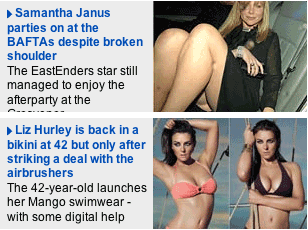
People like pictures on the web - well, except for really old skool geeky people still using command line text only browsers - and the Mail's new Beta homepage makes a picture feature one of their main elements.

The panel rotates through several of the paper's best images of the day, and users can click directly onto any of the stories using the thumbnail strip underneath. This seems to serve the same function as the picture on the front page of the Daily Mail printed edition, which often puts the focus on a 'softer' celeb driven story, rather than the main news agenda of the day. It will be interesting to see what happens with this space on a heavy news day - and whether in the event of another major terrorist attack on the West, for example, the Mail would use this slot to follow the news rather than the gossip.
Even more emphasis on 'Femail Today'
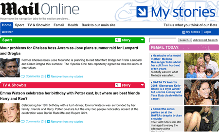
For a long time it has seemed that the Daily Mail has been doing really well online with the Femail content they showcase on the right-hand side of their existing design. The new Beta emphasises that content even more, with an expanded column for celeb-spotting, gossip and style news.
The only risk for the paper here is that the online version increasingly feels more down-market than the printed edition. The online appeal of this style of content is surely one of the drivers behind the Mail's increased ABCe figures. I call it car-crash journalism to be honest. Whether the content is being catty about celebs, or promising me sexy pictures, I find I can't help slowing down to have a look. I hate myself for it afterwards, of course...
Headline pages
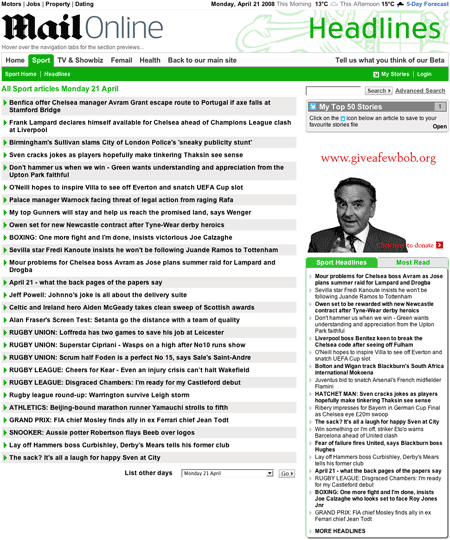
A new feature is the 'Headlines' page. This, on a single page, lists every story published on a particular day in a particular section. Users can navigate through the content by day - rather like on a blog with daily archives enabled. It doesn't appear to map 1-to-1 with what was in the printed newspaper, but it looks like a useful variation on the section-based browse mechanism used across the rest of the site.
Polls
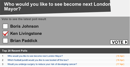
I've spent a long time working on interactive voting applications in the past, and I always like to see them done well. The new Daily Mail Beta has a single 'Polls' page which lists the recent votes that have been run on the site in order.

Casting a vote is a satisfying user experience, with a great big custom tick appearing across the check-boxes on the form.
Fancy that
Shane Richmond has written before about the way that people gravitate towards reading 'silly' news stories online, and the seemingly never-ending life of the BBC's story about the Sudanese goat is testament to that. The Daily Mail beta collects together all of their News At Ten "And finally..." style content into one scrollable graphical strip about halfway down the homepage.

It is a very visual way of showcasing quirky content that is likely to generate click-throughs
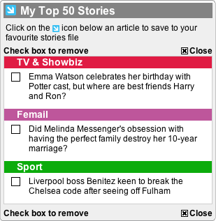
My Stories
The Daily Mail Beta introduces a new way of clipping 'My Stories' to a personalised page. This is enabled as both 'light-touch' personalisation that works without registration based on cookies, and also for registered users who are signed in. Items on the 'My Stories' page are colour-coded and grouped into their parent sections.
Users can also access their stories from the right-hand navigation on pages. A counter indicates how many of their 50 clippings they have used up, and the panel can be expanded to show the stories that have been saved.
The fact that it is a Beta
I love the fact that it is a Beta. Not many mainstream media organisations have been brave enough to engage with widespread testing of new designs on their audience in this way. The Mail is soliciting feedback via an online forum and email, and the hope of course is that they spot any issues early on that are really going to upset their audience, and can fix any technical glitches that their internal testing hasn't spotted.
You couldn't make it up...
It might seem odd on currybetdotnet to find me writing in praise of the Daily Mail, but I am genuinely impressed at the open approach they are taking to their re-design. Of course, there are things that I don't like about the design:
- I find myself irked by the way that you get a preview of the top story from a section overlaid onto the page when you hover over the navigation.
- The homepage seems way too long, with a little bit of everything on it. It lacks a clear focus, and towards the bottom of the page the design gets a bit ragged in my opinion.
- Using a Firefox/MacBook combo I found some rendering problems with the dynamic elements.
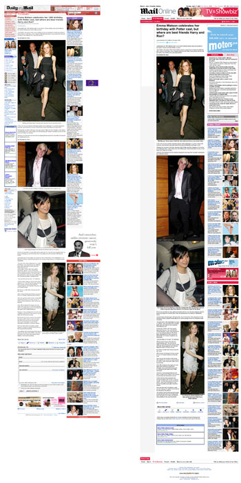
- I don't think they've done much to improve the layout of individual story pages - a side-by-side comparison illustrates they have done little to increase the relative amount of space allocated to stories, or their legibility.
I like some of the new functionality though. It seems to me that they must have clearly identified that the way they think they can grow their online audience is not by emulating the style of the 'serious' newspaper sites of the Telegraph, Times and Guardian, but instead to really put their emphasis on pictures, gossip and 'fun' content. The style of the design supports that. It will be interesting to see, when they launch the site fully, whether they can continue to maintain that audience growth momentum.
Hi Martin,
Like the article, and agree with most of your points. I think the Guardian, Times and others have come up with some good redesigns recently, but it's good that the Mail hasn't tried to copy them too much and keep its own style.
The major problem I found with the beta site was the slow loading and scrolling speed.