Making the most of blog comments: Part 7 - Comment form positioning
A couple of weeks ago I began looking at the implementation of comment functionality on blogs. I'm intrigued that comments are accepted as one of the primary enabling features of the 'blogosphere' conversation, but that much of the functionality around them hasn't changed since blogs first emerged.
Over the next few days I wanted to look at some of the usability issues that can occur with comments on a blog. I wanted to start by looking at the layout of the individual blog post page.
Comment form positioning
One of the ways that blog owners can influence the way that conversations develop on their blog is with the placement of the form inviting users to add their thoughts.
Essentially there are two primary variations on the most popular layouts. The comment form can either be placed directly beneath the post itself, with comments listed under the form. Or it can be placed under all of the responses to the post.
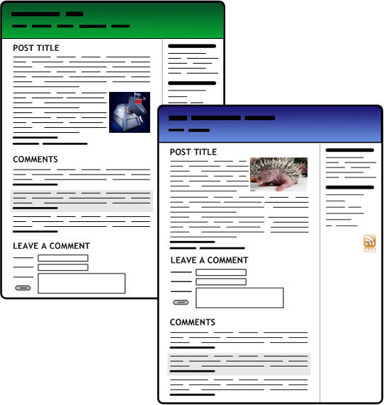
The former invites the user to comment without reading through any discourse that has already taken place. The latter means that the user has to at least scroll through, if not actually read, all of the comments that have previously been left.
Both approaches have their pros and cons. Making people scroll to find the form, and hopefully read the comments along the way, may encourage more of a conversational thread. However, placing the form directly beneath the original post may serve to generate more responses, as it appears before the user just at the moment they are most likely to have an instant response to your post in mind.
You might make the choice based on your audience expectations. Placing the form directly after the post may suit a blog where lots of contributors want to sound off their opinion, but don't particularly want to engage in conversation. This positioning probably suits mainstream media organisations who are more concerned with getting a demonstrable 'volume' of user engagement rather than a 'quality' of user engagement.
Hidden and pop-up forms
Having comments appear in pop-ups has gradually fallen out of favour as blogging applications have got better at handling comment functionality. However, a lot of people using Blogger still have Haloscan implemented as their comment mechanism.
I'm not terribly keen on having comments shifted into a pop-up for a couple of reasons.
The call to action for the user isn't as strong, as they can't immediately see a form to start typing in, and there are accessibility issues with spawning pop-ups.
It also breaks the model of the 'permalink'. If you want to link to someone else's comment, you don't have a hook within the original page to reference. Very often, when linked to in isolation, it is hard to track where a comment pop-up has been generated from.
Finally, from a search engine perspective, if comments in pop-ups get indexed at all, they get indexed in isolation from the original post. Links within the pop-up do not become tied to the original post. This misses an opportunity to exchange meaningful on-topic 'link juice'.
Threaded comments
Some blog platforms are increasingly beginning to support 'threaded' comment views. This means that users can directly reply to another comment, rather than directly replying to the main article.
This seems a slightly odd step to me. Most mainstream media outlets have moved away from this kind of 'threaded' message board view because of the tendency for discussion to break into splinters which are visually hard to follow on screen. Myself, I'm not convinced they add much to a blog discussion. Threading only seems to work in places like Slashdot, where there is already a high degree of online discussion experience and message board literacy.
Placing a call to action
Another additional place where a 'call to action' for people to comment can be located is right at the head of an individual post. This is potentially useful for people who may have read a post via an RSS reader, and wanted to click through and leave a comment. Additionally, putting a comment count in this space gives a visual clue to visitors about how active a post has been.
Tomorrow...
Tomorrow, I'll be looking at some usability issues caused by the technical implementation of blog comments.
Thanks for the post, interesting
but it seems to me that the comment functonality won't change because there are no needs for this