How accessible are Britain's online newspapers? Part 5 - The Independent
Last week I started a series of posts testing British newspaper websites against various accessibility standards and issues. So far I've looked at The Daily Express, Daily Mail, Daily Mirror and The Guardian. Today it is the turn of The Independent.
Text resize
The Independent appears to be almost almost alone amongst the major newspapers in the UK in having a stylesheet 'widget' on the page to allow users to adjust the size of the text that they are viewing without relying on their browser's controls.
This would almost certainly have won The Independent bonus points in the league table of accessible newspaper websites I'll be publishing next week, except for one small detail.
It doesn't work.
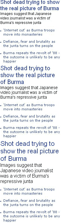
Well, OK, to be fair, it does alter the page layout and font slightly, but it seems to do more to increase the line height attribute of the fonts, rather than their actual size, as this comparison illustration shows. It isn't at all clear to me how the 'largest' text on the bottom of this set of three is meant to be significantly easier to read than the 'normal' sized text at the top.
What makes this even worse is that whilst providing the switching gizmo to alter text size, they have also disabled Internet Explorer 6's in-built ability to do so, so users cannot get a big text size differential using the 'widget', nor can they use their own browser settings to override the default.
Firefox users are able to re-size the text using the browser's controls, however.
Alternative image text
Providing alternative image text on the web is one of the simplest and most fundamental nods to accessibility it is possible to make. Incredibly, The Independent's homepage does not appear to have alt text for all images.
The replica of the printed front page, and the promotional images accompanying the list of features on the right-hand side of The Indy's homepage all appear resolutely blank in a browser if image display is switched off.
JavaScript unavailable
It was difficult to find areas of The Independent's site where a lack of JavaScript caused issues with the site's functionality, but in part this is due to the site being one of the least interactive and functional of the major UK newspaper sites.
One thing that didn't work was the functionality to read similar articles that appears on some areas of the site. This uses a widget from Proximic which produces some related links on both The Independent site and the wider web.
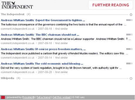
This is a Flash overlay, triggered by a link that relies on JavaScript, so is pretty inaccessible all round. It is a shame, as it seems to be the only innovative feature I've noticed on the whole of The Indy's site.
Browsing using FANGS
Another area I have been testing is how well a newspaper site renders using FANGS. This is a Firefox Add-On that emulates the behaviour of JAWS, one of the most popular screen reading softwares.
The Independent's homepage performed very well on this test. Although the code does not include Accesskeys, or any 'skip to content' links, it only takes a screen reader 103 words to get to the main headline of the page. This was the best performance of any newspaper I tested.
The actual story page was a complete contrast, however. Again there were no links to skip over the navigation, and the screen reader was confronted with 631 words to read out before it reached the main story headline. As a long block of useless text in the way of content, this was only narrowly beaten by the Daily Mail which performed slightly worse.
I shall be continuing this series tomorrow with a study of one of the most graphically visual online newspaper sites - the one belonging to The Sun.
Sometimes you shouldn't put alt text. It's needed when images are part of the content, but when they're not important, there's no point in trying to explain what they are.
Rik, whilst I agree that you don't need to put "Spacer gif" in the alt text one hundred times on a page that relies on them for layout, I strongly disagree that The Independent should leave out alt text here.
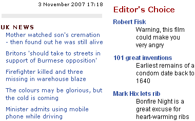
The images that accompany those promos convey a lot of information to a sighted user - for example what film it actually was that Fisk was talking about. It is poor of The Independent to not include any alt text on these images ever, regardless of what the picture actually is.
Of course, I'm just making a general overview of each paper here, and it is quite a crude and simplistic set of tests. Nevertheless I think the tests I have chosen clearly indicate which newspapers are making an effort with accessibility, and which are not.
Again, you haven't posted a screengrab of the pages WITH the images displayed, so it's difficult to be able to make a judgement call here.
However, to take your example of the promo image for the Fisk article, I'd be surprised if the tiny thumbnail had the word 'Rendition' (the name of the film in it). Instead, I bet it was a crop from a publicity still or a frame from the film. So, what is this communicating? Well some readers MIGHT recognise it as referring to the Rendition film, however I bet that for most readers it only gives a vague clue, if that. So really, it's a 'teaser', trying to tempt people into reading the full article by giving away the name of the film - indeed, the slug 'Warning, this film could make you angry' achieves just this. Putting the title in as the alt text would, in this case, not represent an equivalent user experience in text form, but instead a completely different user experience.
A quick visit to the Independent website confirmed to me that they DO in fact use alt tags correctly on all the text-as-image navigational buttons, which they should be praised for. Not putting any alt text on any of the photos is, I agree, a black mark, but a less significant one.
I think in your review of newspaper website accessibility, you should make sure you include the photos that you're referring to AND give your own suggested alt text for these examples. That's the only way to advance the debate here. Simply saying 'all photos should have alt text' can sometimes be more damaging to accessibility than not having any.
I think that would make for an interesting study - taking 100 photographs each from each paper, and seeing how much of the alt text was useful. But not one that I've got time to do ;-)
I do think your interpretation of what is 'useful' and 'helpful' as alt text is very narrow though. See my response to your comments on the Daily Mail review
Journalism.co.uk have a feature testing the accessibility of The Independent with real users which is well worth reading.