How accessible are Britain's online newspapers? Part 4 - The Guardian
I've been doing a series of checks on British newspaper websites to see how they match up to their accessibility responsibilities. So far I've looked at the Express, Mail, and Mirror. Today, in the last of this week's reviews, it is the turn of ex-broadsheet The Guardian.
For each set of tests I have been looking at the homepage of a site, and then the top story from that day's paper, in order to access both types of template. For The Guardian, the difference between these two pages is marked. This is because they have taken a phased approach to rolling out a new look, feel and underlying technology to Guardian Unlimited. Consequently, the template used for the homepage differs wildly from that used for a story page.
The Guardian in fact explain this themselves online, as they have a specific accessibility statement from July of this year:
"In order to make this site accessible to a wide audience we have worked closely with disability consultants the Shaw Trust. We have placed great emphasis on testing with people to ensure a better experience for all users and all technologies.
However we welcome any comments, suggestions or feedback you have for us, please feel free to contact us.
Current status
We are in the process of introducing a new design for Guardian Unlimited, taking care to ensure improved accessibility. The new design currently applies to the front page and all the pages in our Travel site at time of writing (July 2007). Most pages on the Guardian Unlimited network, however, remain in the old design, and hence will not have the same level of accessibility or the features listed below. We will update this page with progress as the new designs are rolled out across more pages across 2007-2008."
Text resize
Some things are the same across the piece however. It doesn't matter if you are on the newly designed homepage or the rather dated and narrow looking individual story pages, the text resizes perfectly well using the browser controls in either Internet Explorer 6 or in Firefox, or, on the new homepage, using the page's built in text size controls.

Alternative image text
All of the images on the Guardian's news story pages seemed to have excellent descriptive alt text in place, as they did on the newly designed homepage. A browser with images turned off tended not to display them however, as they are wrapped in some JavaScript to fly captions over the top of pictures during a mouseover event. The alt text was present in the HTML however.

JavaScript unavailable
I didn't spot any problems with the navigation or functionality of The Guardian's homepage or news story pages, However, in browsing around I did stumble across one navigational issue on The Guardian's blog portal.
Without JavaScript, the funky drop-down menus that expose the blogs underneath each topic heading are all unfolded. This appears at first to be a purely cosmetic issue, and not a greatly important one, since the principle should always be that it is better to display all content options in a messier way, than to hide content permanently from users without JavaScript capabilities.
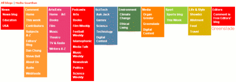
However, I found that in Firefox at least, that not all of the blog names were clickable as links if JavaScript wasn't enabled, which did cause a navigational problem.
Browsing using FANGS
I've used FANGS to emulate viewing the site through a screen reader like JAWS, and got mixed results with The Guardian.
Both the homepage and story pages have a skip navigation link included, which should allow experienced users of screen reading software to jump over the otherwise unholy mess produced when the pages are rendered in this way.
On the day I tested The Guardian site, some badly coded areas near the top of page caused the FANGS output to read out a whole list of parameters for some of the advertising on the page. This meant on the homepage that, unless the user selected the skip navigation link or navigated by header, they had to listen to a whopping 1,062 words before reaching the main headline of the day.
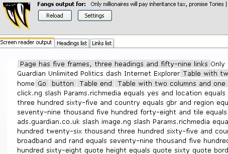
The story page had a similar mess, and it meant that the software wanted to read out another 450 words before the user could reach the content. That meant it was 1,512 words from the start of the homepage to actually getting to read The Guardian's main story. That is one of the worst showings on this test.
I noted that the new homepage template did include specified accesskeys within the code, whilst the older story template didn't, which is a positive accessibility step.
Next week, in part 5 of this series, I shall be examining the accessibility credentials of the online presence of The Independent.
As a colourblind reader, I find The Guardian's site very hard to read when they have pink or orange text on grey in the headers over the features down the right. I don't think producers consider that about one in 200 users have some kind of colour perception disorder. That's a higher percentage than Linux users, and look at the outcry when they are ignored. When it comes to the attention they get, I am green with envy. I think.
Hi Cliff, I did try and do some tests on the papers to detect issues that might affect people with colour-blindness. However the tool I tried to use couldn't cope with the complicated way some of the sites were built so I didn't test them all.
Incidentally, there is an excellent article on journalism.co.uk testing the accessibility of The Guardian site with genuine users with accessibility issues.
The guardian's latest redesign means things have taken a dramatic turn for the worse on the javascript front - it's now required to use the comment functionality.
With JS off, you can't even see the comments, let alone respond. More in my post on the guardian and accessibility.