A thoroughly refreshing approach to news design from ITV News
“It’s possible that we wouldn’t have been able to achieve such a simple and radical outcome if working with a news organisation with an underlying culture of print: we would most likely have trod on too many toes, threatened the privilege of old skills, been seen to be tearing down a valuable legacy.” - William Owen, Made By Many
This week ITV News relaunched with a site that made a radical break with the one they had before, and which frees itself from a lot of the baggage that usually comes when designing a news site. It certainly still has some rough edges, but it is a fascinating approach.
“It looks like a Wordpress blog”
I did wonder if those people tweeting that it looks like a student Wordpress project or a Tumblr blog might have taken a few extra seconds just to consider the scale and popularity of those services. There are nearly 50 million blogs on Tumblr alone, which suggests there must be something in the approach. There is a telling section in the Made By Many blog post explaining the thinking behind the design.
“Our quest for simplicity was sharpened by focusing on two basic and related use cases: ‘As a user, I want to know what the world’s talking about today’, and: ‘As a user, I want to follow the big stories through the day across devices wherever I am’
...
We ignored two other use cases served by most news sites, the ones that result in multiple layers of navigation, being: ‘As a user, I want to find the latest news about a topic that’s a very particular and unique interest of my own’; and, ‘As an editor I’ve got lots and lots of stories that I want you to discover, but they’re all getting in each other’s way.’”
It is the latter use case in particular, where news publishers insist on cramming a route to every single niche part of their content on most pages that leads to the overwhelming clutter we force the user to wade through on most news sites. If you take a page like the ITV News hub for the Toulouse shooting, it is refreshing to see someone really tackle the “living story” concept, with a stream of updates gathered around a news event, headed up with a short standfirst that gives an instant background overview.
Filtering. Not navigation
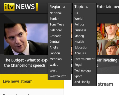
Another interesting twist on the “traditional” news site is the drop-down navigation at the top of the site. I say navigation, but really it is a filter. It allows me to select my region and then a topic, and get a page just about “London health” for example.


The ITV News filters in action
The use of web fonts means that these pages can be generated with on-brand headings dynamically - something that wouldn’t have been possible a couple of years ago. A slight criticism of the interaction design here is that it might be helpful to the user to see a visual confirmation in the filter that something has been selected.
Mobile homepage simplicity
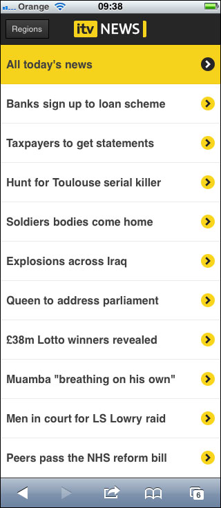
It was the simplicity of the mobile homepage that really caught my eye though. It has a ruthless focus on the one task of giving a very quick overview of the headlines making the days news.

The new ITV News mobile homepage
I can’t begin to imagine the fuss there was when the design was first presented - no dateline, byline, standfirst, navigation, thumbnails. Just a stark list of headlines. But, when you are on the move, that is almost exactly what you are likely to want a lot of the time.
It actually echoes something I built in 2004 at the BBC - bbcrss2wml.pl - which was a hacky script to scrape the RSS feeds of the main football, Leeds United and Leyton Orient sections, and give me a page I could just hit on my old Sony Ericsson T610 on the bus to work to give me a headline overview at a glance.
Integrating other sources
There is a lovely bit of integration of other sources too. In the Toulouse shooting story on mobile, you just find these little nuggets included from Twitter.

An embedded tweet in the news stream on the mobile ITV News site
The embedded tweet comes from someone working for another news network, and links to another news site - but moves the story on. Why take the time and production effort and expense to do a write-through of something somebody else has reported, when you can just embed a tweet with a link through to the main source? Audience informed. Job done.
Snagging
These days I usually refrain from writing about a redesign in the first couple of days - especially if the points I’m going to make are negative. I’ve worked in digital long enough to know that you could always launch with a much better polished product if you wait a few more days, but that you learn nothing gradually working your way down a snag list compared to learning what your audience actually care about. Aspect ratio issues with the images on the mobile version are the kind of thing that is quite quickly fixed post-launch, but should have been avoided.
On the other hand, much has been made of the fact that the infinite scrolling on some pages, as it has been implemented, makes it tricky if not impossible to hit the deck of corporate links in the footer. This may be the first time I’ve ever seen people notice the links in the footer on a news site, let alone want to actually click on them.
Users, content, context. Especially the content
As much as I love the approach, a good user experience is made up of users, context and content. I think the new ITV News format, especially on a mobile device, is brilliant at user context. I’m unconvinced by the content though. Unlike the Sky News iPad app, which I thought was so good it instantly converted me from being a default BBC News Channel consumer to a default Sky News consumer, I can’t see this website becoming my news destination of choice. However, I’ve added it to the home page on my phone to test it for a week, so we’ll see...