Future of web design: Tips on iPhone design and wireframing with Sarah Parmenter and Brad Haynes

This week I've been posting some of my notes from the recent 'Future of web design' conference in London, so far covering the opening keynote by Brendan Dawes, and some discussion of CSS3 with Dan Cederholm and Molly E. Holzschlag. Today I wanted to talk about two very practical presentations - Sarah Parmenter giving tips on iPhone design, and Brad Haynes talking about wireframing.
"10 tips for iPhone User Interface Design" - Sarah Parmenter (You Know Who)
Sarah Parmenter gave a truly great presentation about putting together the UI for applications on Apples mobile platforms. It was packed with juicy details, like the minimum acceptable 'hit size' on an iPhone - 44px x 22px with 12px separating one object from another - and observations of features that have worked well in apps, like the rich landscape mode of the Sky+ application.
Another key tip was designing a great icon for your app. As she said, if your icon doesn't suggest your app is going to have a well designed UI, why, as a user, would you explore it further? She advised following Apple's guidelines very closely, and using one clear silhouette image without any text. She thought the only people who could get away with breaking that rule and use textual logos were brands like USA Today or the BBC, who have a strongly branded presence outside of the app store experience.
It is always great to see someone else show their working, and Sarah put up some examples of her documentation. She thinks there is no excuse for lazily emailing screenshots to clients. Instead she produces a comprehensive overview document for an app. She gives the client wireframes for each screen in two versions - one standalone and one with annotation. She suggests never using colour in wireframes, as it leads to a debate about colours. Another clever little tip was only sending the client versions of the final UI design at a resolution slightly smaller than the iPhone or iPad screen, so that they can't simply pass your work onto another agency or designer to tweak without paying for the fully layered full-size documents.
In fact, Sarah was refreshingly up front and honest about how to charge for work, which I have seldom seen done on a conference stage. She advised freelancers to steer clear of fixed price offers, and instead suggested to charge a day's work for every two completed full UI screens. She's also made her 'App definition chart' available on her website.
"Smart tips for wireframing" - Brad Haynes (Paramore|Redd)
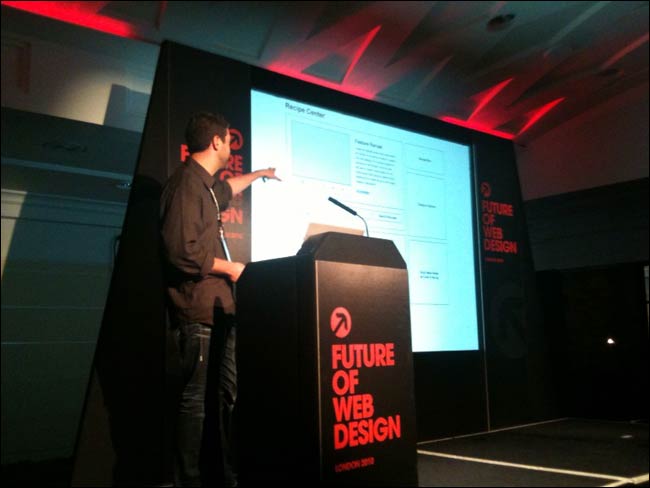
Brad opened with a great little sequence that saw the relative geography between being in the UK and being at his desk at Paramore|Redd in Nashville condensed into around 12 slides with maps, big arrows and labels on them. It set the tone for a fun presentation that was big on visual examples.
He argued that wireframing was crucial to the success of any web project, as it reduces subjectivity when analysing a design. He invoked the memories of Winston Churchill and Bruce Lee to extol the values of planning, and of having 'no style', so that you can adapt to whatever challenge is thrown at you.
The main chunk of the presentation was divided into before, during and after wireframing. Before wireframing he advised a strategy session with the decision makers on the project, to define the scope and produce an outline of what is to be built. This can later work as an accountability tool over functionality change requests, and is important in order to get the fundamental layer of an application right.
During wireframing, Brad illustrated 3 techniques - sketching, lo-fidelity and hi-fidelity wireframes. My joy at seeing someone else's homework is always tempered by the horror that my own wireframing efforts pale in comparison. The example he showed as being at the "low end" of hi-fidelity wireframing was more beautiful than anything I've ever managed as a final design. But then, I guess that is part of the reason I learned to shy away from visuals...
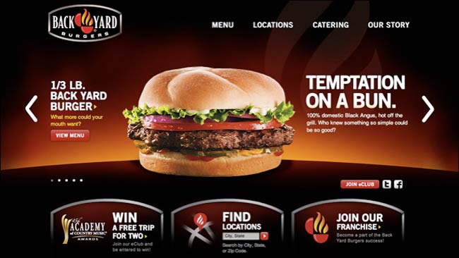
The 'after wireframing' section showed some before-and-after shots of the wireframes compared to the final design, which really illustrated how you don't have to be limited by the 'grey boxes on a page' approach when coming up with a finished graphic treatment. The Backyard burgers project in particular stood out as having a vast transition from a very box-y wireframe to a much more fluid visual approach.
Next...
Next week, I'll have some further notes from the 'Future of web design' conference, looking at buying fonts, inclusive website design, buying fonts, jQuery, buying fonts, emotional interface design, and buying fonts. Did I mention the fonts...?
It's very beautiful the image screenshot you give me there. My background is designer. If I'm starting to make visual is easy, but how do I make interactive visual?
I don't quite understand with the wireframing mumble jumbo.
Is there any start or lead on where I should learn with before making my own app (no clue) and interface (piece o cake)?
Thanks.
Thank you Martin for a great post, i have been researching developement and design of iphone apps and found this blog. I'm really new to this so getting tips and advice will prove invaluable.
William, if you want to get a hang of the 'wireframing mumble jumbo' then I'd at least start with the Apple iPhone and iPad human interface guidelines