The Winter Olympics online review: Part 1
Over the last couple of weeks I've been looking carefully at some of the online coverage of the Vancouver Winter Olympics on newspaper websites. The Games got off to the worst possible start with the tragic death of Georgian luge athlete Nodar Kumaritashvili. This immediately raised some ethical questions about coverage of the Games.
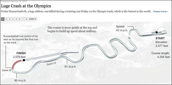
Max Gadney has blogged about how he felt the New York Times infographic of the events leading up to Kumaritashvili's death lacked taste. As he put it:
"This graphic has focussed on the What rather than the Why or How, so is just showing, rather than explaining. The thing is that showing this is not really very necessary or nice. The lack of insight leaves sour taste."
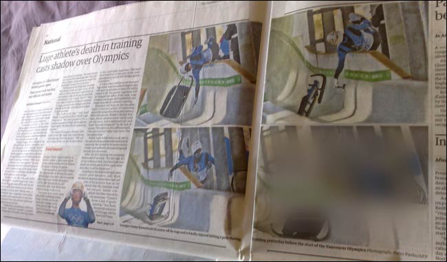
The New York Times was not alone in this. In print, The Guardian, where I work, had a four picture sequence illustrating the accident, including a final frame appearing to show the fatal impact of Kumaritashvili's head on the metal pole. We don't appear to have published these pictures online, but it made for uncomfortable viewing.
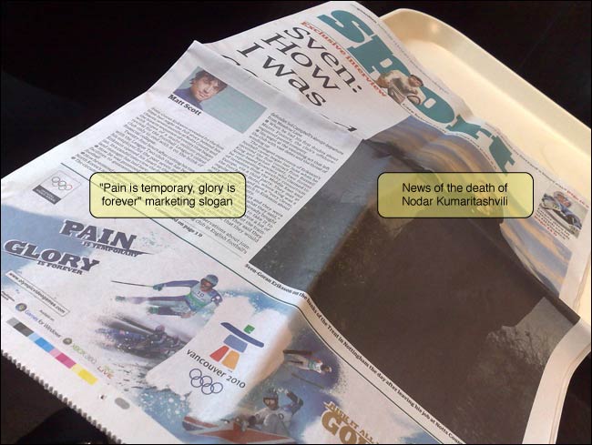
I also noted that Sega continued to market the official Winter Olympics video game under the slogan "Pain is temporary, glory is forever". I can't help feeling that strapline would have been deemed in poor taste if Kumaritashvili had been a higher profile athlete, or from one of the major Olympic powers. The marketing tag even appeared on the front of the Guardian Sport section that was actually carrying the news of the Georgian's death.
Winter sport newspapers for winter sports coverage
In a sequence of events worthy of Charlie Brooker's Newswipe, the media coverage of the Games became a media story in its own right. Olympic officials gave press briefings, where they briefed the press against the negative publicity the Games had garnered, thus generating more instant negative publicity, and a chance for the British press in particular to re-hash all their previous claims.
Given the negative coverage, I wanted to break out of my regular round of looking at English speaking Anglo-Saxon based media sites, and so, instead of the usual 'The Guardian has done this, The Telegraph did that', I've been surveying the serious and popular news websites in countries that traditionally perform well at the Winter Olympics (which doesn't, with the odd exception, include the UK). I've based my choice on the top ten of the medals table at the conclusion of the 2006 Winter Olympics in Torino.
I've been typically looking out for the things that interest me about newspaper website design, interactivity and information architecture. This includes how sites handle social media, the kind of interactives they provide, and how they arrange navigation to their Olympics coverage.
Next...
Irritatingly, it turned out there had been a joint 10th place in Torino in 2006, and so I ended up examining media outlets from eleven countries - Austria, Canada, France, Germany, Italy, the Netherlands, Russia, South Korea, Sweden, Switzerland and the USA. Over the next few days I'll have screenshots, links, and an assessment of some of the most interesting features I found, starting with visual approaches taken by newspapers in South Korea, Italy and France.