The UX of moving house: Part 3 - Experimental interfaces and 'the curse of the tiny image'
I've been posting a series of articles based on my October 2009 London IA presentation "The UX of moving house...with a pregnant spouse". I tried to do a lot of the leg-work of moving online, and so far I've been posting about the mostly dismal search experiences on estate agent websites.
A new look
In part one mentioned the unsatisfactory 'search by map' function that Ellis & Co had. Elsewhere on their site though, they actually had one of the more innovative search results listings pages amongst the estate agent sites I visited. This took the form of a photo-strip of houses, and hovering over the images revealed the price and location. From a pure information architecture point of view, it was odd not to reveal this information to the user immediately, but I rather liked the playful game-like interaction, even if I think the images used should have been bigger to really visually show off the properties.

Another nice touch about this interface was that there was a 'get me out of here' link, which took the user to set of rather more conventional property search listings if they preferred.
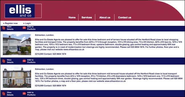
The curse of the tiny image
Small images seemed endemic in the estate agent website user experience. It strikes me as very odd that one of the key ways of selling a house isn't fully exploited.

You can almost excuse small thumbnail images in search results pages on the grounds of space on the screen, but there isn't really an excuse on individual property detail pages. Image sizes of around 300px by 200px are common, not really enough to see significant detail. This full-size screengrab from Spencers site is typical, and shows the image of the outside of the flat at maximum zoom.

However, I wondered if this was because, unlike, for a example a clothes store ecommerce site where you want to maximise the visual impact of the inventory, very often estate agents wish to disguise the true nature of the property they are trying to entice you to view. On the whole estate agents could do a lot worse than read something like "15 Common Mistakes in E-Commerce Design" from Smashing Magazine, and start working out how some of the principle of good ecommerce store design apply to showcasing real estate.
Next...
One of the key factors when choosing the location for a new home is how the commute to work is going to pan out. In the next part of this series I'll be looking at some of the good and bad ways of assessing that online.