Web search at the BBC: Part 4 - Glass onion
In recent years the BBC website was also a place where you could, perhaps rather unexpectedly, search the web using the BBC's search service. In January this year it was discontinued, and so I thought it might be a good time to review the development, rise and fall of the service. Today I'm looking at a period when searching the web became one of the dominant features on the BBC's homepage.
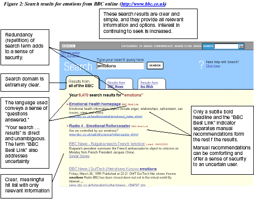
In splendid isolation in basements in Bush House and then the Mortimer Street lab, well away from the rest of the BBC's New Media departments, the search team worked to concoct the follow up version of the BBC's search engine - the pale blue and cream design that lasted for several years. This design was intended to make the search feel friendly and unintimidating to novice Internet users.
It was criticised by some people for looking toy-like, or resembling ice cream packaging, but James Kalbach cited it in his 2003 CHI paper as an example of user-friendly search design.
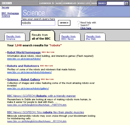
The pages retained the 'tabbed' approach to selecting different 'scopes' of search results, with different colour schemes and banners for the individual scoped searches. This turned out to be an expensive maintenance overhead, and a severe handicap to the client-side coders who had to manipulate the templates.
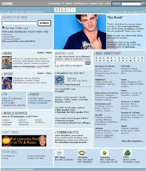
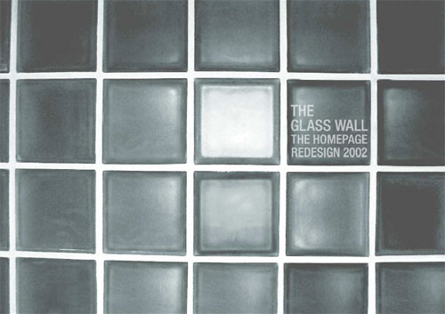
The launch of the new interface had been a pre-cursor to the launch of an intensively re-designed BBCi Homepage. This homepage design work was documented in the PDF booklet "The Glass Wall", which was really instructive in showing how the user-centred design process could be applied to real world Internet applications.
The homepage was designed to please the persona 'Mandy', and the taxonomy management system under-pinning BBCi Search was named 'Bromsgrove', after the location where our target persona, 'Gayle' lived.
As part of that homepage re-design process, the search team were asked what they could offer the design, and I suggested that we could adapt some of my search log mining to produce a list of currently popular searches.
In the Christmas of 2001, I had worked on a small project to produce a page that displayed, ticker-tape style, searches in real time over the reception desk of the BBCi entrance to Bush House. It was this data mining of the search terms being entered on the site that was eventually behind my "A day in the life of BBCi Search" presentation and article, and which, inadvertently, lead to me being an Information Architect today.
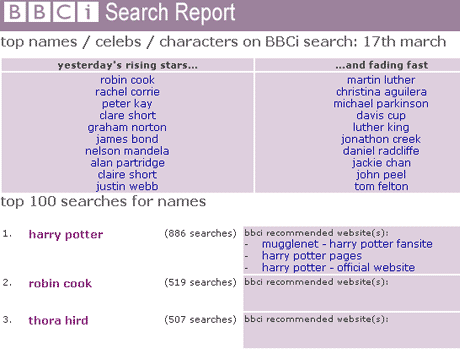
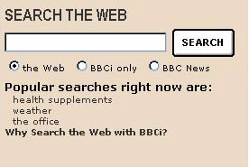
The idea for the homepage was to display three popular searches. There was, naturally, some considerable BBC editorial concern about what might appear, and so technical architect Mark Hewis worked to develop a back-end for the system which produced an editorially approved list of search terms. With great precision, we called it "the big box of words".
The concept was that by default, every search term was forbidden from appearing on the page. Each day the homepage team would go in and see a summary of the words that might have appeared on the page, and decide whether to approve or deny them. Once approved, if they cropped up again, they would be published. We ran the system for several weeks prior to launch, to ensure that "the big box of words" was full before we went public.
It took about 6 weeks of testing to get the algorithm right. One reason that I needed to adjust things was the way that overnight usage of the site changed. During the hours that the UK was asleep, most of the searches on the site were being carried out by visitors from the US and then South Asia. It meant that as the UK woke up, popular terms were often related to searches for news in India and the rest of the Asian sub-continent.
What I also wanted to avoid was the absolute most popular search terms - 'weather', 'eastenders' etc - appearing on top of the list all of the time. Instead what I did was look for the search terms that had increased in popularity. Thus what tended to get listed were things that had suddenly jumped from being 50th most popular search term that day to the 15th most popular. The cycle worked by calculating the relative differences in popularity over a four hour period.
Given that a lot of my work at the BBC ended up being the scoping and specifying of the gnarly back-end systems that powered voting and personalised email delivery, for a very long time, the popular search panel was the one bit of the BBC website that I could point to, and say to my parents: "That's what I do at work"
Next...
In the next part of this series I'm going to be looking at some of the resistance that the web search service faced from within the BBC itself.
I remember visiting Mortimer Street to assist in a code review. That lift there was evil - would go up above the floor you wanted then plunge down!
I think the blue/yellow redesign made the templates easier to maintain than the ones I had to deal with in the original build as it was just a banner change. In the original you had all sorts of colours changing left, right and centre.
It was so painful during the original build that I used a recently attended Perl training course to create a small script which pulled in a 'config' file and inserted colours and files into a template.
This was then run from a batch file. Thus I could change the template for 80 odd scoped searches in a few minutes. Which was fine except some sites like News and World Service, had templates which were quite different which meant doing them by hand.
I still retain the scars. And the script, which I still use in parts of my own website to this day.
I did pass it over when I moved off Search, and I know it got used after that. But ultimately only having one template would have been a hell of a lot easier.