Web search at the BBC: Part 2 - Over the horizon radar
This year the BBC has withdrawn the Corporation's web search service that I worked on for several years at the turn of the century. Yesterday I started a series of posts looking at the history of how it was developed, including some screenshots of design that were user-tested with Flow Interactive in August 2001.
A second iteration of testing was carried out a month later, and by now the design of the search results had begun to take a more concrete and recognisable shape.
The grey colour scheme was not popular though. One user said:
"It's really boring. I'd switch off straight away. The way it looks is horrible... It's like black and white TV. Doesn't look fun. Boring and workey."
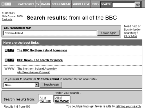
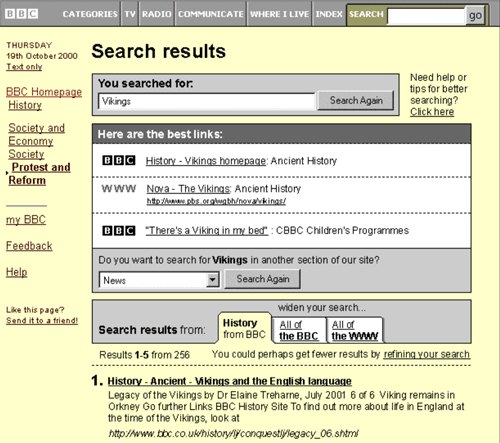
In this session test subjects were also presented with mock-up designs of search results from two different areas of the site - BBC News and from bbc.co.uk/history.
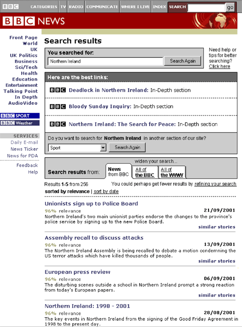
Again the test pages mixed content from the web amongst BBC content within the 'Best links' section, something that the BBC did not eventually implement on the live service.
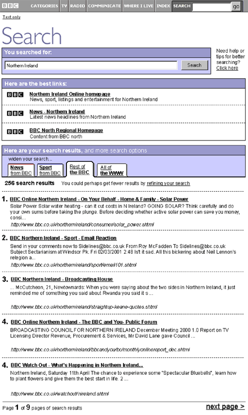
A final round of testing took place in October, and it found that users preferred the lilac layout to the grey version, but that novice users still interpreted the tabs as navigational rather than being connected to their search.
In later years, I've come round to the opinion that until the underlying issues that caused the need for tabs were fixed, no amount of tweaking to the interface was going to work.
Several times since I've hit the problem of having one search box that is trying to deliver a unified search interface across diverse datasets that are being held in different repositories. I've worked with interfaces that use tabs, radio-buttons, drop-down menus, side-bars of results, 'best bets', and still not found a solution that works for all users, all of the time.
The trouble is that is very difficult to convey up-front what scope a user can expect.
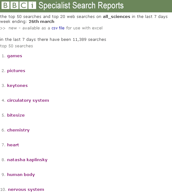
As you can see from this set of the top 10 searches on the BBC's Science site from March 2003, plenty of searches were about people trying to navigate across to another section of the site, not about getting results restricted to the area of the site they were on. The fifth most popular search - Bitesize - was looking for science content held in a different 'silo' to the bbc.co.uk/science site where these searches were made. And Natasha Kaplinsky, for all her talents, is not a scientist.
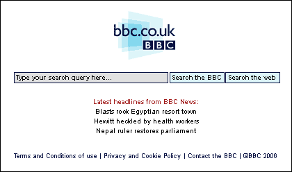
When the lilac-flavoured BBCi search service was launched in 2001, users could, for a while, reach the service from www.bbc.co.uk/search.
I always thought that, with the addition of some headlines, this would have functioned perfectly well as the BBC's homepage.
You can also get an overview of this search design process from a presentation Matt Jones gave at the 3rd Annual ASIST Information Architecture Summit in Baltimore in 2002.
Next...
In tomorrow's third part of this series, I'll be talking a little more specifically about the strategic reasons that the BBC introduced a web search service in the first place.
good work, i think part of the problem, is that all the developers are too advanced in their searching habits, and are totally unable to put themselves in the shoes of normal users.