Taking the 'Ooh' out of Google: Getting site search right - Part 9
I've been writing a series of posts about getting site search right based on my presentation at the Euro IA Summit in Amsterdam this year
In the last part I started looking at some examples where search user experience goes wrong. In order to entice the masses away from Google, a site search needs to be on the top of its game, and avoid things like intrusive adverts, opening unnecessary new windows, and providing an inconsistent experience.
Another sure way to remind users just how familiar they are with Google is to deviate from search results convention for no great purpose.
Conventions are there for a reason
In the Netherlands, freesheet De Pers has an idiosyncratic results display. The first handful of results have thumbnail images and a full description.
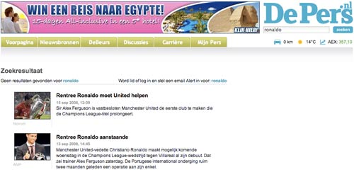
However, after nine results, the format changes to a plain listing of titles alongside the publication date, with an icon to indicate if the content is video. Although this increases the number of results displayed with each search, it also reduces the amount of information the user can glean by scanning those results.
Hovering the mouse over the headline does produce a pop-up overlay of the story summary, but this seems like making the user do extra unnecessary work to me, precisely because the amount of information that is available to be taken in at a glance has been reduced.
Ten blue links
The model of 'ten blue links' has become a standard way of displaying search results. Occasionally sites deviate from that. User studies show that people very rarely turn to the second page of results for a search, but with some European newspapers they don't have to.
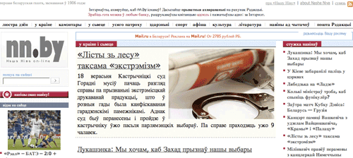
In Belarus, Nasha Niva delivers 200 results as a default. That makes for a lot of scrolling. With the average page coming in at 24,500 pixels deep, that makes for 44 pages worth of scrolling on my MacBook.
I should add that their search results page is probably actually the least of Nasha Niva's worries. They've faced a constant battle to survive in the teeth of opposition from the Government, and their fight to keep printing has attracted support from luminaries like Václav Havel. At one point they were forced to operate without an office because it had been closed down by the state. The newspaper retains a small circulation, and is distributed in Belarus chiefly by volunteers and by post, as the paper is excluded from the state-owned monopoly newspaper distributer.
Only offer choices if their is a choice
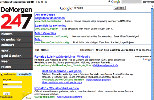
There is no point having dead-end options, and no point giving the illusion of choice if there is no choice. Earlier this year, De Morgen in Belgium had a curious search box on their homepage.
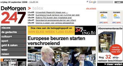
Next to the Google logo is a radio button to select web search.
Yet there is no alternative option - when I did the research for this article, it appeared that De Morgen only offered Google web search.
Next...
Next week I'll be drawing this series to a close. I'll be looking at how search interfaces shouldn't include every feature made available to them by the underlying technology, with examples from Poland and Greece.