Reviewing The Independent's re-design for the Press Gazette
I had another piece appear in the Press Gazette a week or so a go, in their 'Expert Eye' column, looking at the recent web re-design by The Independent.
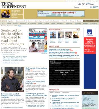
I'm broadly approving of the new design, and certainly see it as a major step forward for a newspaper that earned a scathing review in my 'How Web 2.0 are British newspapers?' series last year.
The site is more visually appealing, with a greater emphasis it seems on opinion and comment. I like the new 'Open House' blog, even if I'm a little unsure about the colour-scheme, but perhaps my favourite little design touch is tucked away in the top right-hand corner - a one line, sometimes cryptic, teaser for an article.
As ever, for reasons of space, some of the points about the design I would have made hit the cutting room floor before the Press Gazette even got to see the copy. The finished article doesn't appear to be online, but here are some of my thoughts that didn't quite make it...
Tricky navigation
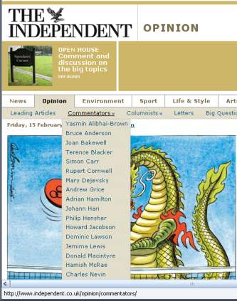
I'm not a great lover of drop-down menus that require mouse-overs in order to unfold, especially when they become nested. The Independent's global navigation features this, and I find it quite tricky - and I've still got excellent motor control. Well, before about 10pm most nights, anyway. You can see some of the problems I've identified in this video clip.
To navigate to the Mark Steel columns, for example, you need to click on 'Opinion'. Then you need to get your mouse down to the link 'Commentators' without straying over the 'News' or 'Environment' top level categories, as that will make the secondary list of topics change.
Once you've successfully got the 'Commentators' menu to expand, you then have to get straight down to 'Mark Steel' without deviating to the left or right and causing the column to disappear. Unless your monitor isn't huge, in which case Mark Steel is too far down the list to be on-screen, you can't scroll the list, and consequently you can't reach his writing.
Not an easy task with perfect motor control, let alone if you have some trouble controlling the mouse.
The clue is in the name
There seems to be an unnecessary fascination in the new design with adding a 'NEW' label to any story that has been updated since the print edition of the paper hit the streets. If I'm on a news site, I expect the stories to be the latest news. And especially if I'm looking at headlines in a section titled 'Latest news', I don't need to also be told that the stories are 'new'.
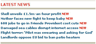
The Independent runs the risk of looking a little like the Yahoo! circa 2000, littered with yellow 'New' icons as they frantically tried to scale their hand-picked directory to match Google's indexing power.
Multiple search boxes
In the Press Gazette piece I mentioned that the new design places the social bookmarking links up at the top of an individual story page, which is a slightly non-standard position for them.
I'm ambivalent about that, to be honest. What they lose in not being available when a user reaches the bottom of the page, they may gain by getting someone to bookmark on impulse as soon as they are gripped by the opening content of a story. In any case, I have a hunch that heavy users of social bookmarking sites generally have their own preferred method of submitting sites using bookmarklets or browser extensions rather than relying on the placement of buttons on individual pages.
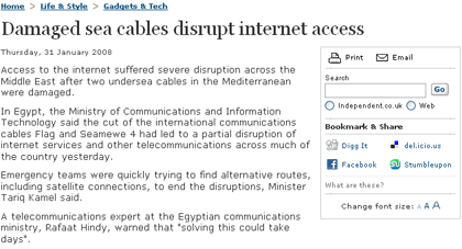
There is a slighter odder placement in that box though - the duplication of a search input box that also appears in the top right-hand corner of every page on the site, and in the footer of every page on the site.
It means that on every story page on The Independent's site there are three individual search boxes, which seems a little like overkill even to a search engine fanatic like me.
Proximic
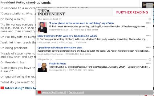
One other function I wanted to mention were the links to the Proximic publisher widget service at the foot of selected stories. Selecting a link marked 'Interesting? Click here to explore further' triggers a pop-up Flash overlay. This is dynamically populated with related links to the story from both The Independent's site and the wider Internet. I believe they are the only UK news site using the system, and I think they could make more of it.
And finally...
The Independent have their own run-down of the new features on the site, and the Online Journalism Blog had an excellent summary of the new web 2.0 bells and whistles that the re-design added. Ryan Bowman also published his take on how it could be visually improved.