How accessible are Britain's online newspapers? Part 6 - The Sun
I'm writing a series of posts about how British newspaper websites perform in a series of accessibility tests. These include simple things, like whether the text on a site is re-sizeable within major browsers, and more complex issues like how the site is rendered by screen reading technology. So far I've examined The Daily Express, Daily Mail, Daily Mirror, Guardian and The Independent's sites.
This post looks at the accessibility of The Sun's site. Unfortunately for me, after I'd done all the testing on the site, The Sun launched an online re-design. That meant I had to do the work all over again. On the bright side, it did at least give me an insight into whether they were moving towards more accessibility, or less. In the end the results were a bit mixed.
Text resize
The Sun fails this basic accessibility test. Within Internet Explorer 6 it is not possible to re-size text using the browser's own settings. The situation is little better in Firefox. Some of the text on the page can be made larger, however this breaks the layout, causing elements of the left-hand navigation to start disappearing behind the main content.
However, The Sun takes a very graphical approach to the news - which is one of the reasons why the homepage has such a heavy download footprint. This means that the appearance of the main headlines does not change, regardless of the browser's text size settings.

Alternative image text
By taking such a graphical approach, where many of the main homepage headlines are embedded within images rather than in HTML text, The Sun puts quite a burden on the alt attribute. On the whole it performs this task well, and much of the homepage has alt text that describes the headline contained within the picture.
There are some exceptions though, and I noted a couple of panels where the alt text was 'newsbreakleft' and 'newsbreakright'. There was also still some placeholder text on the live site, with the alt tag for the RSS feed icon reading 'lorem'. Of course, given that following the relaunch it seems all of their RSS feeds have moved address and don't link back to the site properly, perhaps this isn't such an issue.
I did find one major problem on the site for users who cannot access, see, or read clearly the contents of images. The Sun's My Sun user-generated content area is an innovative space that I've written about before. It allows users to post blogs and images, and join in discussion forums and comment on stories. It can be quite lively, and really adds a flavour of the newspaper's audience to the site.
However, it is only the perfectly sighted part of The Sun's audience that can take part.
The registration process for My Sun requires users to pass a CAPTCHA test. There is no provision within the code for treating users differently if they are unable to read the fuzzy numbers and letters, nor is there any link on the page for people to get additional help to pass the test.
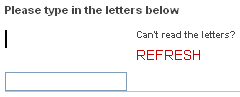
This is pretty shoddy work by The Sun, which like The Daily Mail, is excluding not just the blind, but people with poor eyesight from contributing to their site, when there is no need to place a barrier in the way. There are established ways of providing an alternative to the visual CAPTHCA which will meet accessibility requirements without compromising the protection they provide against spam.
JavaScript unavailable
Not having JavaScript available caused some significant navigational problems on The Sun's site. One of the four key top-level navigation links in the newspapers online masthead is a drop-down menu labelled 'Take me to...'
Without JavaScript enabled, the menu not only doesn't take you to anywhere, it doesn't even expand to give you a choice of places not to go.
There were also problems with the left-hand navigation. This has top-level categories on display like 'News' and 'Sport', and then some sub-categories on display, like 'Football' and 'Wrestling'. There is then a link to 'MORE' under Sport, for example. Without JavaScript, that link does nothing, and so the user is unable to expand the menu.

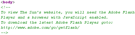
In fact, The Sun do tell users that they need JavaScript enabled to view the site - but it is hidden within a HTML comment on the page, which seems an odd place to put information for a user.
Browsing using FANGS
Part of my testing has been to see how the sites render using screen reading technology - in this case FANGS, a Firefox Add-On which emulates the popular JAWS software. My test has been to see how many words the screen reader would have to speak to reach the main headline on a site's homepage, and how many words to get to the meat of that story on a subsequent page.
The Sun managed to put a lot of things in the way of a user getting to their stories. It takes 544 words to get from loading the homepage to the link to the main story, and then 728 more words to actually get to the story itself, making 1272. This total was second highest to The Guardian.
However, The Sun is one of only four of the newspapers I've looked at which included a 'skip navigation' link. Experienced screen reader users will be able to get to the content much faster than the mere number-crunching exercise implies.
In the next part of the series I shall be looking at the accessibility of a newspaper which over the last year has employed an aggressive online development strategy - The Telegraph
There's a certain mad genius to putting the JavaScript (and indeed links to FlashPlayer) in a HTML comment!
Well, in fairness, I did find it, but I'm not sure there is much future in it as a technique ;-)
Your research into how websites cope with text resizing is interesting. However, there's a genuine dilemma amongst web developers over what best practise is.
Websites are generally designed so that they can be viewed on the lowest-resolution screen setting that's still widely in use, eg either 800x600 or 1024x768. When the text size is increases, you can either scale up the column widths in the same proportion (maintaining the design but causing horizontal scrollbars to appear on low resolution browsers), or fix the column widths and simply allow the larger text to stretch the page downwards (which breaks when the length of long words exceeds the width of the column).
Neither approach is intrinsically better than the other, it does of course depend partly on the site in question.
There is a third, largely untested option, which is to allow the column widths to grow in proportion, maintaining the layout, but never so wide that it exceeds the width of the browser window. Unfortunately, this isn't possible in CSS*, and so requires complicated Javascript code.
*You can set a max-width() attribute in CSS, but IE ignores it, and you can't dynamically set the max-width based on the size of the browser window.
There is a way to get IE to do a max width, but it's a bit clunky. I do it on my blog for IE5 and above. (Can't remember if IE7 actually uses max-width of not - can't say I've tried it)
The code looks like this:
<!--[if gte IE 5]><style type="text/css"> #all {
width:expression(document.body.clientWidth > 1000? "1000px": "auto" ); }
</style><![endif]-->
Yep, that's some JavaScript in there. Unfortunately my nice corporate IE prevents me from disabling JavaScript and I can't remember what happens if JavaScript is disabled. I presume the code stops working.