Why doesn't the BBC iPlayer system tray icon use native Windows UI elements?
Well, it's been mostly iPlayer this and iPlayer that around here recently, and today is no different - and this time I have a bit of a user experience gripe.
The iPlayer library software does something that really annoys me on Windows machines - not taking advantage fully of the common native UI elements.
One of the reasons that any OS like Windows or a Mac OS has a standard set of UI elements is so that they can be adapted at a global level, rather than on an application-by-application basis.
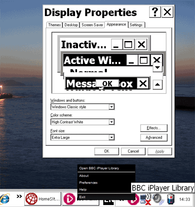
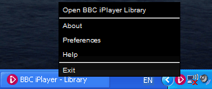
For some reason best known, I guess, to Kontiki, they feel that their choice of visual appearance is better than the user's choice for how contextual menus should appear. When you right-click on the iPlayer's system tray icon, you get a menu format distinctive to the iPlayer, with small white text on black.
This over-rides any settings you have made on Windows, which, frustratingly from an accessibility point of view, means it doesn't respond to changes in the OS to help people with visual impairment.
Setting Windows to a high-contrast display scheme with extra large fonts has no impact on the iPlayer contextual menu triggered from the system tray.