Newspapers 2.0: RSS links on The Guardian's new homepage
It never ceased to amaze me how you could spend nine months working on the redesign of a site, using every ounce of your professional experience, attempting to solve as many of the problems you knew were in the existing solution - only to be drenched with email screaming "What have you done, idiot!" within hours of launch.
Certainly at the BBC you would have been able to play buzzword complaint bingo, as you could guarantee that within 24 hours of any redesign you would have been called amateurs, accused of letting schoolchildren or YTS kids do the work, and been told you'd "dumbed down" a service.
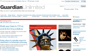
It was refreshing to see that the same happens at The Guardian, where Emily Bell and Siobhain Butterworth have been wading through the uncomplimentary email in the wake of their homepage redesign.

I suspect, though, that my complaint about the new homepage is probably unique.
Since they launched it whilst I was on holiday, it rendered my post about where newspapers give information about RSS on their homepages out-of-date before it had even been automatically published in my absence.
Actually, as it turned out, not a great deal changed with the placement of RSS information on the page.
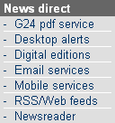
The Guardian was already the only paper out of the eight I looked at to promote their RSS feeds on the right-hand side of the homepage. This remains, but is now shunted up to be alongside the main horizontal navigation in the masthead area.
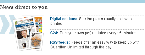
There is also a second mention of RSS, in the footer of the page. The redesign is being touted as a gradual process, so the link goes through to the same RSS Help as when I reviewed the paper's Web 2.0 credentials a couple of weeks back.

The mention at the footer of the page is part of a "News direct to you" section. Whilst the promotion of the individual items with more space and associated artwork is more visual than on the previous iteration of the page, the positioning of these services has been demoted, from the upper right-hand side of the page to the footer.

And my overall snap verdict on the redesign?
I like it - lots of good use of whitespace, and lots of information on the page, but it does seem very, very long. Will anyone ever scroll down to find out what was the "Most Read on Guardian Unlimited"?