Reboot:bbc.co.uk - the designs so far
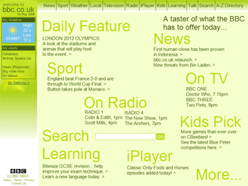
Ever since I began using bbc.co.uk I have always thought it looked as if someone had discovered FrontPage and decided to use tables to make a site, filling the cells with nasty colours.
Just one of the frank bits of feedback the BBC's reboot:bbc.co.uk competition has received. I have been contributing to the blog, and the competition closes next week. So far there have been around fifty entries put on show in the gallery. The standard has been quite varied, and I certainly don't think there are any that could be used stright off - rather making those people who claimed it was the BBC's way of saving money on a million pound re-brand look even sillier. There are certainly some good ideas and concepts there though, and there perhaps ought to have been a separate prize for anyone who didn't reference Doctor Who once in their page.
My single favourite feature so far must be the weather display on Paul Michael Smith's Web Service BBC Homepage.
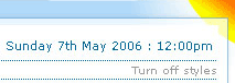
Instead of a complicated forecast panel, it has an ambient icon in the top right-hand corner indicating the current weather. ---stream--- by cath also has a nice variation on the weather - instead of the map there is a user-submitted picture of a weather scene.
The designs seemed to fall broadly into two camps - pushing the existing boxes around (and maybe adding some or taking some away), or going very minimal. Of the few that tried to do something very different I really liked Fresh by Dynamo Matt
I liked the tag cloud feel to the whole page. There something very tactile about it as well, and I rather hoped it would all be realised in Flash and that you could drag the different sections around the page to please. It also had something about it that escaped the rigid news goes here, sport goes here that the kind of content on the BBC homepage seems to dictate. I thought it was one of the few designs that had scope to do "specials" with, or to completely rearrange just for the duration of the World Cup for example.
Probably the most pleasingly bonkers entry so far is Modern Grey by Sam, with draggable Flash headline boxes you can position yourself around the page. reboot:BBC by Andrew has quite a pleasing balance to the page, but some of the functionality is left a little unexplained. Likewise Jake Mycock's entry "Play, Find, Share" looked like it had promise - but it also looked like play, find and share were tabs, and I wanted to be able to click on them and find out what was underneath.
One of the most thoughtful entries has been Tim Dennell's BBC START. He has contributed some valuable points in the comments of the blog, and his notes to accompany the entry has some gems in it.
The web is only 17yrs old. Most people have spent most of their lives without it. In the UK 40% of people still don't have the Internet; many will be catching up in the next few years. As well as designing for 17yr olds, we're also designing for their parents and grandparents.
I'll be having a look at some more of the designs on Monday.
The entries vary a lot. But the main thing I notice is that most of them are purely a redesign of the current page, with no additional Web 2.0 integration. Then there are those who try to integrate Web 2.0 in a forced way, by just putting Flickr and de.licio.us on the page. There are just a few (at most 5) designs who really tried something new with both design and Web 2.0 integration. Don't you agree?
Wow. I am very flattered. I just stumbled across the page by Googling 'Dynamo Matt' to see what it came up with and I ended up here! :)
I'm glad you like the concept of the design. I deffinatly think flash would be somewhere to go with the design. And as you've said, it is a flexible design so those categories could be changed by the Beeb or the user as appropiate.