Looking at the new BBC search
Earlier this month the BBC did a long overdue revamp of the site's search facilities. Of all the services I worked on at the BBC, search is the one I spent the most time on, and the one I am most curious about the continued re-development of. Before I left the BBC I had seen some concept work for the new design, but when it launched on May 11th it was as much of a surprise to me as it was to the rest of the BBC's users.
I say the re-vamp was long overdue because the last redesign of the BBC's search interface was in May 2002, around six months after the version before that had been launched. The design centred around a series of tabs that segmented BBC content from the web, and various silos of BBC content from each other. In the intervening four years there had been a couple of attempts to get a search interface redesign project up-and-running within the BBC, but without the "flavour of the month" status it had back in 2002 it was always difficult to get the resources together to do it properly until now.
The new version really updates the look and feel. With the old design you often felt, particularly from the homepage, that hitting the search page had transported you back into the web's past. Now the new design make the homepage look even more blocky, and the old fashioned half of the pair.
The updated service has a very comprehensive graphic help section to go with it, with some very clear explanations of the differing functionality on offer
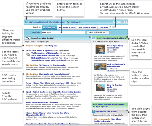
Usability studies had shown that people consistently failed to grasp the concept of the 'tabs' on the results page showing them different sets of results for the same search. As I have mentioned before, usability also suggested a similar percentage of people didn't understand the radio button mechanism or the drop-down menu mechanism, which often left the design team somewhat stymied.
I like the new 'tab' format in the BBC's results. They have been redesigned to look more like buttons and placed above the search box. This really enhances their visibility, and allows the use of an arrow-mark icon to closely align their function with that of the search box.

It looks like a very straightforward interaction system to me, and a good attempt at a solution to a tricky problem. Additionally the different result selections are clearly colour coded.
Then again, it is always difficult to guess quite how users are going to react. I remember in one set of user testing in 2002 someone was asked to search for their favourite TV programme. They faithfully typed the title of the show into the search box in the toolbar part of the page, and then confidently hit the 'TV' link in the toolbar.

Tomorrow On Thursday, I'll be looking at the integration of Audio/Video results into the new service.
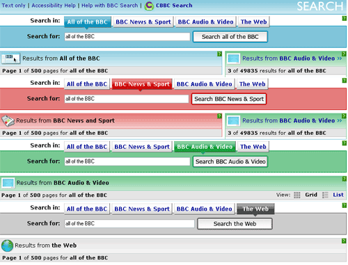
There are some problems with the new search. One is that when you do a search on the news or sport sites, you aren't taken to news or sport results directly.
That may have some advantages that I'm not aware of, but I find it very frustrating.
My problem with it is threefold.
1. It's counter-intuitive. If I'm on the BBC news page, and I type in a search term, it means I'm searching for that in the NEWS. That should be the default.
2. It's a retrograde step. The old one had ways of refining your search down to a set period of time, and so on. Did it allow you to define the sorting too? Perhaps. The new one lacks both. Or has hidden it, and frankly, that's the same.
3. Worst of all, sometimes it just doesn't work. If I know I've read a story about something, and I type in a key word from it, I want it to find it.
I too find the BBC News search to be quite confusing and less effective than it was...