Guardian responsive redesign beta gets web fonts
This week some of my ex-colleagues at the Guardian unveiled the latest update to their public beta of a responsive redesign - using a version of Guardian Egyptian that has been hinted for the web.
The beta.guardian.co.uk site is now using the Guardian Egyptian font
I’m absolutely thrilled, because I listed it as one of my regrets when I left the Guardian - that I hadn’t been able to win the battle to use web fonts.
The responsive beta site is a work in progress, as explained in this blog post by Matt Andrews, and at the moment is only aimed at small screen devices, but it is genuinely lovely to see the Guardian taking a step into improved web typography. Tremendous care was taken over the legibility and readability of the iPad edition, but it always felt like the website was a poor distant cousin of the typography used in print and in apps.
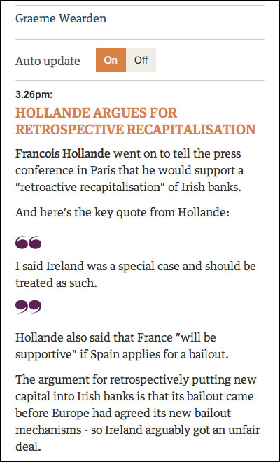
An excerpt of a live blog on beta.guardian.co.uk
I’m very much looking forward to watching beta.guardian.co.uk progress as the team scales it up to work on bigger screen sizes.
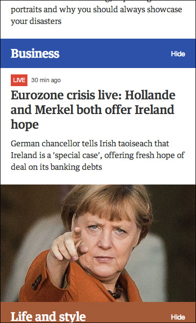
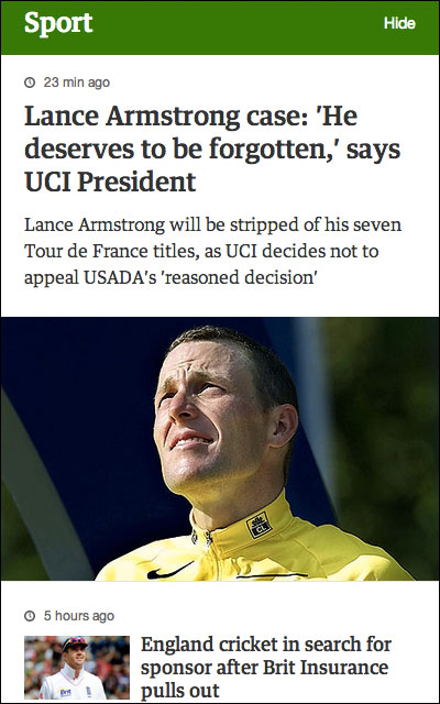
More of the beta.guardian.co.uk homepage