A peek behind the scenes at the design process of The Times' Eureka app at Hacks/Hackers London
At Hacks/Hackers London last week Design Editor Matt Curtis and Picture Editor Madeleine Penny from Eureka, the science magazine app from The Times, gave a brilliant presentation about how they had gone about developing it for the iPad.
It was really refreshing to see someone in the news industry talk about all of the difficult things that had happened in a project as well as all the good things. At the end I was rather inclined to give them a sympathetic hug, on account of the way they had coped with tight deadlines and long hours to get a product shipped on a device with very little prior art.
[In fact, I was a bit drunk, and I think I did offer...]
One of Matt’s main points was that as they started developing the magazine app, only Wired had really done something similar in the marketplace, and they were a couple of weeks into the project before they even got their hands on the device. I can sympathise with that, as the development of The Guardian’s Eyewitness app, which went live on the day the iPad launched in the States, was done with access only to the SDK.
There were several editorial challenges with the Eureka project as well. Usually the magazine is multi-featured, but for the app they had been commissioned to produce a “themed” issue - “We don’t want Sports Illustrated” the team were told, ”we want Sports Illuminated”.
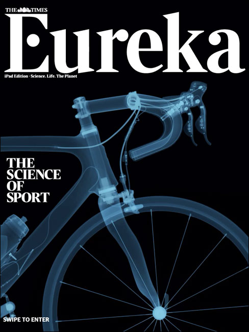
There is some great content in it, including an x-ray examination of a Team Sky racing bike. As Madeleine said, you could easily make a bike graphic spin round 360 degrees, but everybody knows what a bike looks like from behind. Instead they took an approach that encouraged the reader to explore the graphic.
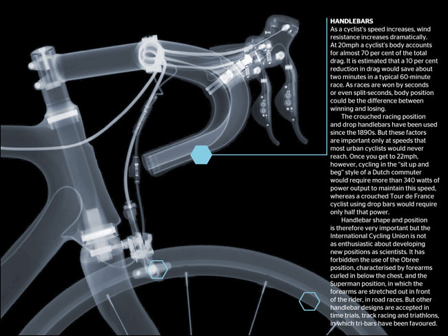
Interactive based on x-ray photos of a Team Sky bike.
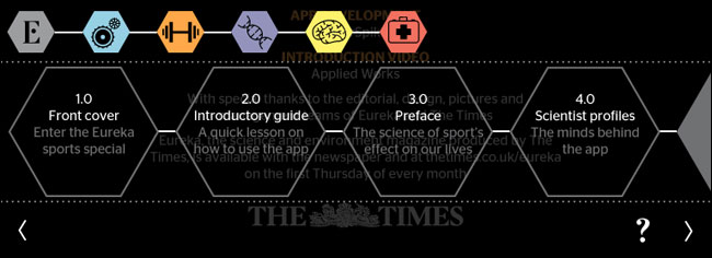
Navigation proved a challenge. Matt said that it was easy to get lost in apps like the Wired digital editions. Madeleine explained that the colour-coded honeycomb navigation helped users to keep themselves orientated.
Talking of orientation, Matt expressed a common frustration with designing for the iPad. Apple pretty much insist, and the device implies, that content works in both landscape and portrait mode. Yet it isn’t as if the “magical” device “magically” does the layout for you. You have to do the design twice.
With the time constraints they had, they opted for a mostly fixed layout, with an icon indicating to the user when to switch the device around.
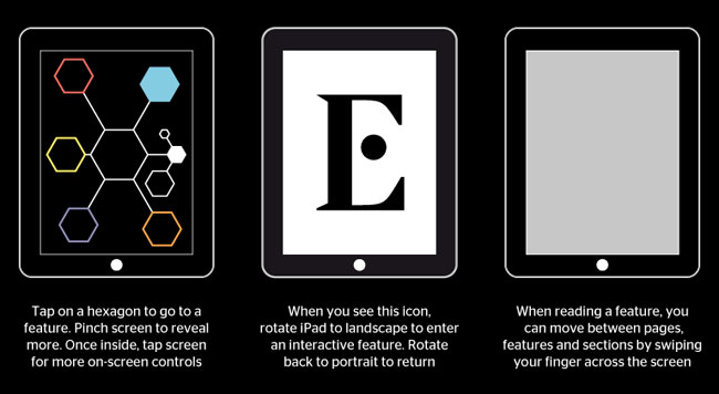
A rotating ‘E’ icon indicates to the user to change their iPad viewing orientation.
It isn’t an entirely satisfactory solution for either consumer or publisher. Matt said he had sleepless nights about the decision to mostly stick to one layout, and admitted “Deep down, I don’t think this is the best way of presenting editorial on an iPad”.
I think there will be a lot of people feeling like that about tablet design and layout for some time to come. As I’ve said before, I don’t subscribe to the hype that touchscreen devices need as radical a change to editorial design as the invention of paper required, but I do think that we are in the equivalent of the web’s “animated GIF years”.
I thought it was an excellent presentation and a very frank look at the challenges. I played around with the app when it was first released, and there are some very impressive touches in it, particularly the way that the images that accompany a particular story accompany it as you scroll down the text, and I loved the Tour De France “speed wheel”.
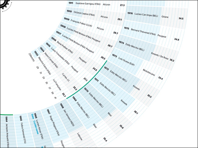
Tour de France “speed wheel” interactive.
As you scroll down the article on the left, the images on the right change in order to accompany the text you are currently reading.
But I think that overall my very favourite moment of the talk was when Matt showed an animation that featured things whizzing all over the place, and said, “As you can see...it is all about the journalism”.
Next...
Also at Hacks/Hackers last Wednesday were Martin Moore and Ben Bradshaw talking about the Media Standards Trust manifesto for more accountable digital journalism. I’ll have my notes from that talk up in the next few days.
In the meantime, you can entertain yourself with this animated sketch drawing of Matt Curtis made on the night by Matt Buck.

“Hacks/Hackers London: Notes from the talks” brings together notes from 16 talks, including those from Martin Rosenbaum, Stephen Grey, Alastair Dant, Scott Byrne-Fraser and Wendy Grossman. It looks at topics of interest to journalists and programers alike, including freedom of information, processing big data sets to tell stories, social activism hack camps, the future of interactive technologies, and using social media to cover your tracks - or uncover those of somebody else.
“Hacks/Hackers London: Notes from the talks” for Kindle is £1.14.