The UX of moving house...with a pregnant spouse: Part 1
In October last year I gave a presentation at the London IA in the Pub meet-up in Islington, about "The UX of moving house...with a pregnant spouse.". In 2009 year we bought a house in London, and because of the impending arrival of Emma, I had to do much more of the leg-work than I'd usually hope to get away with. That, of course, meant trying to do as much as possible the lazy online way, taking lots of screengrabs along the way, and writing copious notes about how, on the whole, the user experience was really rather poor. Over the next few days I'll be posting about some of the good, bad and downright baffling things I noticed along the way, starting with the initial task of finding a house to buy.
House hunting
I suspect that estate agencies are one sector of business that is yet to feel the full effects of the digital revolution. At the moment people are not used to shopping around online for houses, and, as you'll see, some of the tools are extremely crude to assess such a large investment. However there are some emerging technologies and websites which are doing a much better job of having an online presence than the average local estate agent
Estate agent search
In essence, buying a house is one long act of searching, and so you'd think search would be one of the leanest and most optimised areas of estate agents sites. It should also be noted that we are also dealing with very structured information here - every house for sale has a price, a location, a distinct number of rooms and so on. In short, a search engine designers dream.
However, the search experience on estate agent websites is almost universally bad. I was looking to buy in my old home town of Walthamstow, so all the examples are based on the estate agents active there, but I suspect my findings would hold true for any area of the UK where you are trying to buy a house.
One typical example was Ellis & Co, who had recently acquired the Adam Kennedy agency. They'd redirected the Walthamstow Adam Kennedy website to their own - which is a sensible move. Search is presented up front on their website, with several options.

I did note though that, although they had re-directed me to this site because I was looking for a property in Walthamstow, at the time they hadn't added Walthamstow to the drop-down list of branches in the search form.
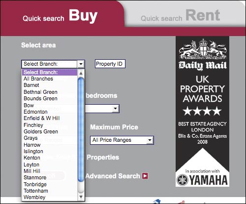
Users could input a property ID to search for. I assume this meant that you could plug in a number you'd either spotted in a branch window, or in a local newspaper property ad. The agent would be familiar with the required format, but I thought it might be helpful to most users to give an example as a hint here, to help people recognise the ID from their adverts. It also seems odd to have that as one of the most prominent pieces of information on the search input form, unless it is mainly there as a shortcut for people in the office.

Search by map...or not
Their search by map facility turned out to be more like a 'search by our organisational structure'. First of all, in the interface, a little icon of an arrow appears by the 'Search by map' label. This invites a click, but isn't actually clickable. Once you realise that you have to click the text label rather than the icon, you are taken to an abstracted map of the British Isles.
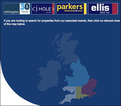
Four areas are colour-coded, and above the map are the logos of 4 different regional brands that the company operates. The coloured strips next to each brand logo don't appear to correlate with the colour-coding on the map - none of them are blue for example.
Clicking on an area of the map does not drill down to perform a more local geographical search, as I expected. Instead it simply redirects to the website of the regional brand - which in my case meant returning to exactly the same Ellis & Co homepage I'd literally just left, nowhere nearer having narrowed down the geographic range of my potential results.
Next...
The information architecture and user experience I've described so far pretty much sets the tone for the whole experience of trying to use online tools to conduct a house move. In the next part of this series, I'll be looking more closely at the typical search results screen you are returned when searching for property online.
What you needed, clearly, was a massive online de-facto monopoly operator.
(Really. There's nothing on any other site over here that's not there.)
Nice analysis!
At the risk of pre-empting the next article, I just bought a house and loved Rightmove's RSS search results.
Search by postcode (e.g. N16) and any other filters and then subscribe to the RSS - repeat for each postcodes you're considering.
Bundle them all into a folder in Reader and suddenly looking for property is like reading a blog...
Of course, that assumes that all the property makes it onto Rightmove quickly...
I have to say that looking for houses online is really time consuming and I eventually got really sick of it. I found myself spending hours at a time looking for houses online because the search facilities are so bad.
The search by area lists are particularly bad if you want to search quite a few areas. You just keep having to go back to the start, since they rarely allow you to search more than one at a time.
The best one I found was the GSPC site (covers the Glasgow area). Not sure if there are ones for areas down south but I know there is an ESPC for Edinburgh.
It had a map that you could zoom in and out of and you could just place circles over the areas you wanted to look at. It was definitely the best one.
We moved in 2006 when our first baby was due - crazy! Fortunately, the family rallied round to help, but my wife still insisted on overdoing it. Baby arrived just two weeks later
If you want to search quite a few areas. You just keep having to go back to the start, since they rarely allow you to search more than one at a time.