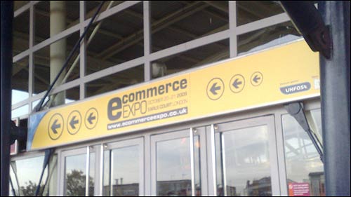
Ecommerce Expo: Part 2 - "Persuading users to buy & eliminating checkout drop-offs"
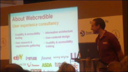
Last week I started blogging about my visit to the Ecommerce Expo in Earls Court, where I attended some of the free seminar sessions that were on offer. If you can pick your way through the more obvious sales pitches, then there are usually a few worth visiting. I first posted about a case study from British Airways on multi-variant testing. Today I wanted to write about Trenton Moss from Webcredible, and his presentation on optimising the checkout process.
"Persuading users to buy & eliminating checkout drop-offs" - Trenton Moss, Webcredible
Trenton was on solid ground at the Ecommerce Expo, as the entire event was geared around persuading people to buy. He was looking at user experience and design factors in persuading people to shop, rather than technological solutions. He started off by demolishing some common Ecommerce myths, including the idea that you should just copy Amazon. They do 'crazy things' on their product pages, he said, like having them really too long, allowing you to wander off and buy the same products from competitors for a lower-price, and featuring Google Ads.
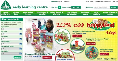
He stressed the need to optimise both the browse and search paths to products - and suggested that sites would usually see a 50/50 per cent split of users preferring one or the other. He praised ELC for their navigation - they had clearly identified two distinct user groups. You could find products using a standard kind of inventory navigation, which would be useful for parents who are accustomed to shopping for their children. Or you could just plug into the 'shop assistant' feature the age and gender of the little one you were buying for, and how much you were prepared to spend. This would then list a range of suitable products.
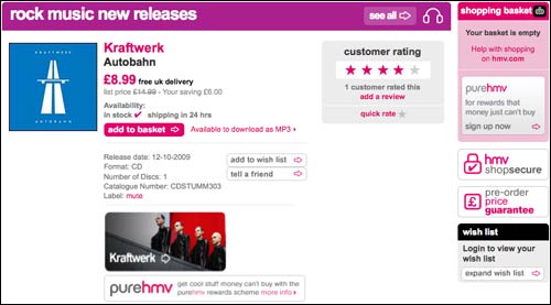
I've never been terribly impressed with the HMV online presence myself - they've struggled with digital - but Trenton saw some good things happening on their product pages. Their 'Add to basket' button was bright and in the centre of the page, and eschewed the Americanism of 'Add to cart'. It also didn't say 'Buy now', which is an inaccurate description of what it does, and can make people think they are committing to a purchase.
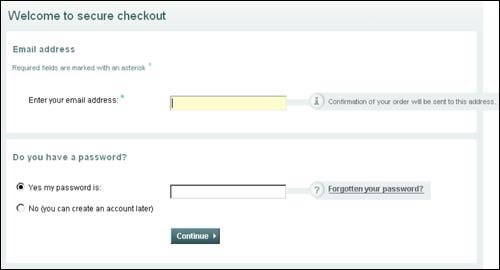
Trenton looked at ways in which an interface can 'allay fears'. He cited the John Lewis checkout process as a page which has several elements in the interface which encourage trust, from the simple use of the word 'secure' in the form heading, to explanations of why John Lewis need information to fulfill your order.
Interestingly, Trenton did not at all mention any security technology to provide reassurance - unlike the Verisign presentation I saw the following day that seemed to imply that 97% of people in the world would not buy from your site unless you had a green browser bar and a 'verified by Verisign' logo plastered on every page of your site. Funny that!
He had some great examples of poor usability. One was a boots.com registration page that tells you your password is weak and has to be between 6-12 characters after allowing you to choose a password, and having provided no prior guidance. He also showed a Norwich Union Aviva form that was saying a phone number was invalid, even though it appeared to be perfectly correct. Trenton made the important point that as a savvy web user, he was able to guess that it was the presence of the space that was causing the form to choke. However, the error message didn't say that, and he reckoned that many web users would not know how to validate the input. His key learning from this was to 'design errors out'. If you can anticipate user error on your web form, then you should be able to mitigate against it.
You can download his slides from http://www.webcredible.co.uk/expo.ppt and you can also download Webcredible's annual web usability report. And come on, you have to trust a man whose company makes everyone walk around with "User experience specialist" written on the back of their t-shirt, no?

Next...
Next I'll have a write-up of a presentation I went to by Andy Leaver of Bazaarvoice entitled: "Social commerce prioritisation: Where should we start?"
Hi Martin, their site is producing a 404 for the report - any ideas?
Cheers James
The link is fixed now James. Not sure if that was my fault, or whether the short URL they showed at the conference expired. I suspect the former...
Some great insights here as to how the "big players" are getting it right (...or not!).
I can't believe that companies such as Aviva and Boots are not testing and improving these pages. Schoolboy errors right on their sales page!
Great post Martin. I think the optimization part is really key to selling any product (or for that matter the website). Without SEO optimization (backlinks, obtaining a higher pagerank, etc..) no website/product could find success