Sony Connect relaunches with improved information architecture for browsing
One of the projects I worked on before Christmas at Sony NetServices in Austria was the information architecture and wireframes for a redesign of Sony's European music download service - Sony Connect.
The service allows users to buy music for upload onto their digital Sony Walkman devices. This is handled by Sony's SonicStage music management software, and the Connect store acts as a web interface into the service over the internet, and then as an embedded store when you are running the SonicStage software.
I had two principle aims when overhauling the information architecture of the site:
- Make the purchase experience easier to use
- Make it easier to browse the content available on the site
Making the purchase experience easier to use
Improving the purchase flow was the more difficult of the two to achieve. I would have liked to have moved to a nice straightforward 1 -> 2 -> 3 stepped process, but that wasn't going to be possible.
My flow diagram of potential paths to purchase was very complicated, as the variables didn't just include whether a user was registered or not, or whether their payment details were on record, but we also needed to detect if they were using the SonicStage software, or viewing the site through Internet Explorer, and we also had to check whether they even had SonicStage installed.
Another complication was that Sony has been attempting to grow reach for the service with the use of promotional vouchers and offers - free tracks given away through partners like Pringles, or with vouchers included with new hardware purchases.
That meant that the payment page had to accommodate three totally different modes of payment - either using stored credit card and banking details, registering new credit card or banking details, or the entry of promotional voucher codes.
In the end we settled on an approach which used active and inactive colour states for buttons on the page, in order to channel the user through the route they were most likely to take given their entry point. Although all payment options are available to them, users are visually cued to either use vouchers or other methods of payment.
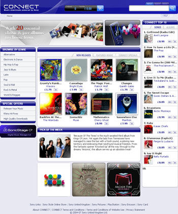
Without having SonicStage installed and your own Sony Connect account it is difficult to illustrate this, but the most obvious visual change on the web store to improve purchase flow is that the contents of the users shopping basket are now up-front-and-centre as the user browses the site.

Previously the shopping basket icon was tucked away in top right-hand corner of the page, in amongst the links to help and account management.
Making it easier to browse the content available on the site
This was the main area that I wanted to fix on the site.
The recording industry is very driven by the concept of new releases, and of promoting new artists and new content. To that end it was important that the screen real estate in the new design was used to promote the current content.
However, one of the strengths of retailing music via digital download is that you can offer a huge inventory of stock, and cater for the 'long tail' of demand. The previous Connect visual design wasn't making the most of this advantage.
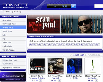
If the user didn't want what was in the shop's front page store window, their routes through to other content were not easy. Aside from searching directly for an artist or title, a drop-down menu allowed them to select different genres - but this lead to mostly promotional pages again dominated by recent content.
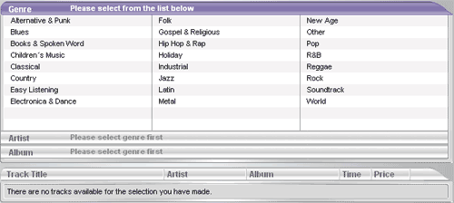
There was also an explicit "Browse" option in the menu, which led to a dynamic interface into the stores content. Here, the user could choose a music genre...
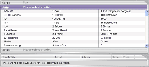
...then an artist...
...then one of their albums or EPs...
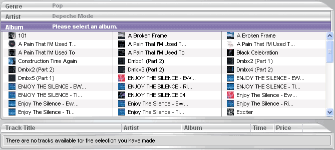
...and only then they could finally see the tracks available.
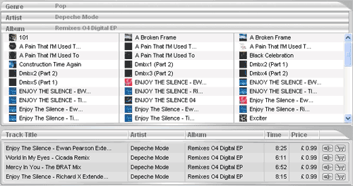
Whilst progressive disclosure like this can work well, it didn't work on the old version of the Connect store. This was due in part to the technical implementation, and in part because the method didn't suit the volume of data involved.
Consider, for example, the number of artists in the "Pop" genre on a music download store. If the user selected "Pop", they were faced with a mammoth list of names to scroll through - or at least they were once the page had loaded. Because the data was fetched dynamically, it was not unusual to see load times for the "Pop" genre in excess of 10 seconds on the old version of the store.
This was clearly an unacceptable state of affairs.
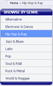
New genre based A-Z browse mechanism
So, the first change was to make it easier for users to reach the genre homepages. Instead of a drop-down menu, which concealed which genres the store covered until activated by the user, we made the whole range of genres visible in the left-hand navigation.
Then, on each genre page, we made a prominent feature of an alphabetical set of links.
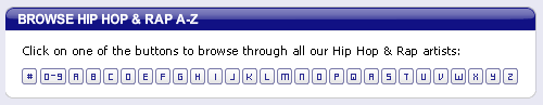
Clicking one of these links brings up a list of all the artists in that genre for that letter.
This improved both the speed of performance of displaying the artist list, and the ease of the user in assimilating the information (since it now only consisted of artists starting with only one letter in only one genre).
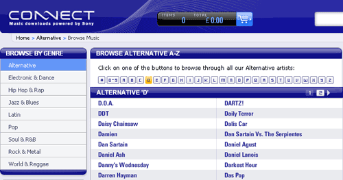
From this list, the artist name now acts as a link to their artist page, displaying all their available music from the store. This is preferable to the narrow funnel of the old browse mechanism, where the user was forced to browse down to the granularity of the individual track level before they could progress from the structured "Browse" page to the artist or album page.
Improved browse sign-posting
As well as the genre appearing in the crumb-trail navigation, whilst the user is browsing through a particular genre it is also sign-posted as active in the left-hand navigation
At the same time we also improved the sign-posting of lateral navigation through the content.
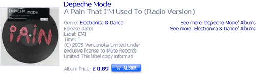
When the user gets to an individual album's detail page, it was always the case that clicking the artist name would return the user to the artist's homepage, clicking the genre would take the user to the homepage for that genre and so forth. This still remains the case both in the metadata associated with an album, and in the crumb-trail navigation of the page.
However, although this is fairly standard behaviour for an online music store, these don't necessarily look like links due to the visual design. In order to assist with this, on the right-hand side of the album details page we have now added explicit calls to action inviting the user to explore more content by that artist, or in that genre.
"Sony Links" navigation
Another area of the navigation that has changed is the prominent positioning of the "Sony Links" panel.
In the previous version of Connect the left-hand navigation carried links to other Sony properties, and this appeared on all the pages of the site.
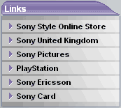
For the new version, all these still appear, as part of Sony policy to cross-link their online properties. However, they have been significantly demoted in importance, being relegated into the footer area of the page.

This means that the left-hand navigation area is now specifically for music store links, rather than acting as a constant distraction to the user to leave the Sony Connect store.
I'm generally happy with the changes to the site, but tomorrow I want to go on to look at some of the areas where the new design doesn't, in my opinion, work quite so well.