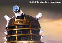
Putting a F__k Off Dalek on the BBC Homepage isn't big or clever - part 3
This is part 3 of a 4 part article - 1 2 3 4
![]() Download a print version of this article
Download a print version of this article
Audience Reaction - What We Found
You simply can't please all the people all of the time, and we received a lot of contradictory feedback. Some people were annoyed that we had reduced the number of links on the page, and so had removed their regular routes to certain content:
"Half the links are gone - I have to go through more than one page to find them now"
"If I were new to the site I think I'd find it a bit bare and may not look further to find the true wealth of content"
"I look for the BBC7 link each day and it appears to be missing"
Equally, others were pleased that there was less on the page:
"crisp", "simple", and "much less clutter"
The size of the page also elicited a lot of comment - but for everyone complaining that the fixed width of 770 pixels looked ridiculous on their large monitors, we seemed to get another complaint that on their smaller monitor set-up the page was too large and required a lot of scrolling past the Dalek to get to the content.
"the big white space at the top of the page was a bit like a building with the ground floor missing"
"why can't you centre the body to avoid the imbalanced white strip on right hand side"
We made one definite mistake. Realising that people might prefer the regular version we included a link to return the user to the standard page layout. However, we didn't set a cookie to store that preference, so users received the Dalek again if they browsed away from the homepage and then returned. This annoyed quite a few users, and if we were to produce a page as drastically different again I would want to ensure that the preference was recorded.

What was very interesting for us was that without having to commission and pay for a new usability study, we got a sample-size of 1,500 people commenting on all sorts of aspects of the way they use the BBC homepage. There were anecdotal comments "I like to check it for the news and weather before I go out", comments about using the homepage as a starting point for specific journeys, and lots of praise for the way the site is usually laid out.
"One of the great success stories of the BBC is the website - a model of clarity and elegant design"
"as the world leaders in web design its good to see new indicatives"
"The present homepage is clear and represents the BBC well. It is respected for its design across the net."
The negative reactions, however, were often strongly negative - some accused us of the dreaded double 'd' words - 'Dumbing Down'
"Is there nothing the Beeb won't dumb down? Please give us the old one back."
"Page now lacks the detailled [sic] information on BBC services. The old one allowed 'one click access' to the main BBC services. Dumbing down?"
"The new home page is too much. The graphics are overpowering. Information is no longer the focus. Is the BBC intent on dumbing down to the lowest common denominator?"
The colour wasn't always popular either - we picked a set of browns to compliment the gold casing of the 2005-style Daleks, but the page was used shortly after the BBC had changed the style of the weather maps used on television, which depict the UK landmass in brown.
"not content with turning Britain brown in the weather you've turned the homepage brown as well?"